Podrobné kroky na vytvorenie výkonného lievikového grafu Excel
Základom úspešného podnikania je jeho predajný kanál. Narábanie s komplexnými údajmi však môže byť náročné, čo bráni vašej schopnosti preskúmať váš predajný proces a identifikovať oblasti zlepšenia. Graf lievika Excel je vizuálne pútavý nástroj, ktorý osvetlí vašu cestu predaja. Táto príručka vám poskytne know-how na vytváranie efektívnych lievikovitých grafov v Exceli a prevedie vás sériou krokov od usporiadania údajov až po prispôsobenie grafu. Uznajme aj najlepšiu alternatívu, MindOnMap. Budeme pokrývať obe techniky, čo vám umožní vybrať si najlepšiu metódu, ktorá zodpovedá vašim schopnostiam a požiadavkám. Premeňme vaše údaje o predaji na hodnotný a poučný vizuálny príbeh.

- Časť 1. Vytvorte diagram zúženia v Exceli
- Časť 2. Výhody a nevýhody použitia Excelu na vytvorenie diagramu zúženia
- Časť 3. Najlepšia alternatíva k MindOnMap
- Časť 4. Časté otázky o tom, ako vytvoriť graf zúženia v Exceli
Časť 1. Vytvorte diagram zúženia v Exceli
Táto príručka vám poskytuje Excel diagram lievika s potrebnými zručnosťami na vytváranie výkonných lievikových grafov v Exceli bez ohľadu na to, kde ste na svojej ceste. Prevedieme vás každou časťou procesu, od prípravy vašich údajov až po vytvorenie grafu, ktorý potrebujete, pomocou ľahko sledovateľných pokynov na transformáciu informácií o predaji na jasné a významné znázornenie. Začnime tým, že sa naučíme, ako vygenerovať zúžený graf v Exceli.
Uistite sa, že zahŕňa každú časť vášho predajného procesu, ako sú správne miery pre každý krok. Usporiadajte si informácie do jednoduchej tabuľky v hárku programu Excel. Každý riadok by sa mal týkať konkrétneho kroku a každý stĺpec by mal predstavovať inú fázu.
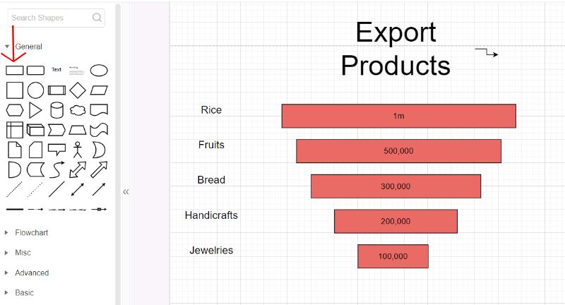
Kliknite na tlačidlo Vložiť na páse s nástrojmi Excel. Potom prejdite do oblasti grafov na pravej strane pásu s nástrojmi. Pomocou možností ponuky vyberte štýl grafu. Vyberte lievik. Tým sa do vášho dokumentu pridá základný predajný lievik.
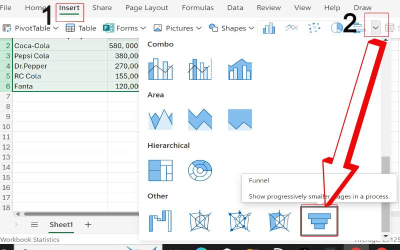
Zobrazí sa okno Výber zdroja údajov programu Excel. Uistite sa, že je v tabuľke zvýraznený správny rozsah údajov vrátane názvov štádií a ich metrík, a ak sú vstupy správne, kliknite na tlačidlo OK. Na paneli s nástrojmi Excelu vyberte tlačidlo Vložiť. Kliknite na tlačidlo Grafy na pravom konci panela s nástrojmi.
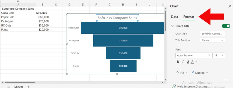
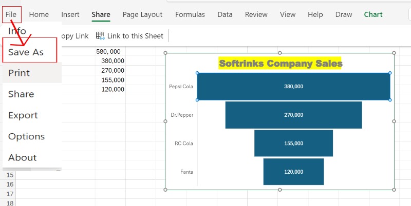
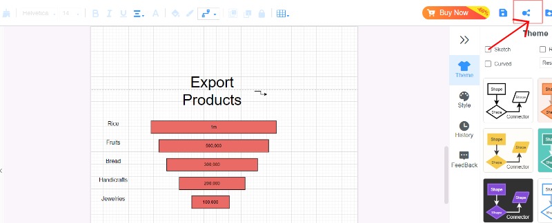
Ak chcete zlepšiť pochopenie, zvážte pridanie názvu grafu a štítkov osí. Zadajte názov grafu do oblasti názvu grafu, kliknutím pravým tlačidlom myši na osi upravte štítky a mriežky a potom uložte graf zúženia kliknutím na ponuku Súbor a uložením.
Časť 2. Výhody a nevýhody použitia Excelu na vytvorenie diagramu zúženia
Keď sa naučíte vytvárať lievikový graf v Exceli, výber Excelu ako vášho nástroja pre zúženie grafov je jednoduchý a užívateľsky prívetivý spôsob, ako to urobiť. Pred výberom je však dôležité zvážiť dobré a zlé body. Tu vychádzam z vlastnej skúsenosti.
PROS
- Excel je populárny program dostupný takmer na všetkých počítačoch, čo znamená, že nebudete musieť míňať peniaze navyše na softvér.
- Keďže vaše údaje o predaji často prichádzajú vo formáte tabuľkového hárka, Excel tieto údaje priamo integruje do grafu zúženia, pričom okamžite zohľadňuje aktualizácie.
- Šablóna grafu lievika v Exceli umožňuje úpravy farieb, štítkov údajov a rozloženia pre lepšiu viditeľnosť.
ZÁPORY
- Grafické schopnosti Excelu zaostávajú v porovnaní so špecializovanými programami na vizualizáciu údajov.
- Pre základné lievikové grafy stačí Excel. Ich vytváranie však môže byť časovo náročné, najmä v prípade zložitých grafov s rozsiahlymi údajmi alebo zložitým formátovaním.
Moja osobná skúsenosť
Spočiatku bol Excel dosť dobrou možnosťou na vytváranie diagramov zúženia na sledovanie môjho pokroku v predaji. Keď sa však moje potreby skomplikovali, uvedomil som si, že majú limity, čo ma prinútilo hľadať iné atraktívnejšie a užívateľsky prívetivejšie možnosti. Excel je skrátka skvelý nástroj na základné lievikové grafy, ak vám to vyhovuje a potrebujete niečo zadarmo. Ak však chcete detailnejšie vizuály a krajšie rozhranie, zaobstarať si špeciálny nástroj na vizualizáciu dát by sa možno oplatilo.
Časť 3. Najlepšia alternatíva k MindOnMap
Hoci je Excel populárnou voľbou na vytváranie zúžených grafov, objavuje sa nepredvídateľný konkurent: MindOnMap. MindOnMap poskytuje viac než len myšlienkové mapy! Je to všestranný nástroj, ktorý vám umožňuje vytvárať rôzne vizuálne zobrazenia vrátane lievikových grafov. Má jednoduché rozhranie a funkciu drag-and-drop, vďaka čomu je skvelý pre nováčikov. Jeho výkonné možnosti sú však pre skúsených používateľov.
Hlavné vlastnosti
• Umožňuje vám jednoduchým pretiahnutím prvkov vytvoriť graf zúženia.
• Podnecujte svoju kreativitu pomocou pripravených šablón lievikov.
• Poskytuje široký výber funkcií prispôsobenia farieb, tvarov, fontov a obrázkov, aby bol váš lievikový graf jedinečný.
• Spolupracujte so svojím tímom na grafe zúženia v reálnom čase (s platenými plánmi), čím sa zabezpečí hladká spolupráca a zdieľanie spätnej väzby.
Prejdite na našu webovú stránku a vytvorte si bezplatný účet. Preskúmajte dostupné šablóny grafov a vyberte vývojový diagram.

Môžete poskladať tvary a vytvoriť tak zúžený graf. Vyberte si obdĺžnikový tvar a posúvajte ho, aby vyzeral ako lievik. Kliknutím na každý tvar upravíte jeho text a informácie. Pomocou možností formátovania zmeňte farby a písma a pridajte ikony, aby bola pútavejšia.
Keď ste s grafom lievika spokojní, je čas ho dokončiť a zdieľať alebo uložiť v rôznych formátoch ako JPG, PNG, PDF alebo priamo s kolegami na prezentácie.
Časť 4. Časté otázky o tom, ako vytvoriť graf zúženia v Exceli
Ako vložiť lievikový graf do Excelu?
Tu sú podrobné kroky na vytvorenie a lievikový graf v Exceli. Grafy zúženia pomáhajú ukázať, ako sa údaje pohybujú v rôznych krokoch alebo fázach, ako sú kanály predaja alebo fázy procesu. Usporiadajte svoje informácie do tabuľky a zoraďte ich podľa krokov a ich hodnôt. Rozšírte údaje viac, vrátane názvu. Prejdite na kartu Vložiť. Stlačte tlačidlo Vložiť a potom vyberte Zúženie. Zmeňte graf pridaním štítkov k údajom, zmenou farieb a vyladením ďalších častí pomocou ponuky po kliknutí pravým tlačidlom myši.
Ako pridám štítky údajov do grafu zúženia v Exceli?
Nájdite svoj graf zúženia a vyberte ho, aby ste do grafu zúženia v Exceli začlenili štítky údajov. Nájdite znamienko plus v pravom hornom rohu grafu a uistite sa, že je vybratá možnosť Štítky údajov. Prejdite na miesto Nástroje grafu, kliknite na kartu Návrh a vyberte tlačidlo Pridať prvok grafu. Potom umiestnite kurzor myši na oblasť štítkov údajov a určte, kam ich chcete umiestniť. Kliknite na štítky údajov, vyberte možnosť Formátovať štítky údajov a upravte ich podľa potreby.
Aký je rozdiel medzi stĺpcovým grafom a zúženým grafom?
A stĺpcový graf je skvelá na zobrazenie porovnávania rôznych skupín, pretože sa ľahko číta a veľa sa používa. Na druhej strane, graf zúženia je ideálny na zobrazenie krokov v procese. Uľahčuje pochopenie údajov v každom kroku a upozorní na to, keď sa zmenšujú alebo menia.
Záver
Diagram lievika Excel je známy svojou zručnosťou pri manipulácii s údajmi a ponúkaním širokého spektra možností, no vyžaduje si dôkladný a zložitý postup. MindOnMap poskytuje skvelú možnosť vďaka svojmu priamemu rozhraniu a základným funkciám, ktoré zjednodušujú úlohu pre používateľov, ktorí hľadajú efektívnejší a intuitívnejší prístup. Rozhodnutie medzi Excelom a MindOnMap závisí od individuálnych požiadaviek, ich odborných znalostí so softvérom a stupňa zložitosti potrebnej pre diagram zúženia.