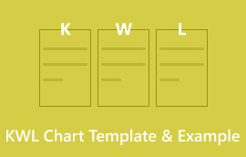
MindOnMap တွင် ပိရမစ်ဇယားကို ဖန်တီးရန် ပြည့်စုံသော လမ်းညွှန်နှင့် ခွဲခြမ်းစိတ်ဖြာခြင်း။
သင့်လျော်သောအစားအစာစားသုံးမှုစိန်ခေါ်ခြင်းအပေါ် သင်၏အတွေးအမြင်များကို ခွဲခြမ်းစိတ်ဖြာကြည့်ဖူးပါသလား။ မင်းရှိတယ်ဆိုရင် မင်းတစ်ယောက်တည်းမဟုတ်ဘူး။ Mind mapping သည် အကူအညီပေးရန် ဤနေရာဖြစ်သည်။ ဒီနည်းလမ်းကို ဖန်တီးပေးတယ်။ အစားအစာပိရမစ်ဇယား. သတင်းအချက်အလက်ကို စီစဉ်ရန်နှင့် ပရောဂျက်များကို အမြင်အာရုံဖြင့် စီစဉ်ရန် ၎င်းကို သင်အသုံးပြုသည်။ ဆွဲဆောင်မှုရှိပြီး အလိုလိုသိသည်။ ဤအသေးစိတ်လမ်းညွှန်ချက်သည် သင့်အား ပိရမစ်ဇယားတစ်ခုပြုလုပ်ရန် နက်ရှိုင်းစေမည်ဖြစ်သည်။ MindOnMap ၏အင်္ဂါရပ်များကို ကောင်းမွန်စွာအသုံးပြုရန် သင်သိလိုသမျှကို ကျွန်ုပ်တို့ ဖြည့်ဆည်းပေးပါမည်။ သင့်ဒေတာကို ရှင်းရှင်းလင်းလင်း အသုံးဝင်သော ထိုးထွင်းအမြင်များအဖြစ် ပြောင်းလဲရန် သင်ယူရမည်ဖြစ်သည်။ အသစ်ဝင်လာသူများအတွက် ၎င်းကို စတင်အသုံးပြုရန် လွယ်ကူစေရန် ပိရမစ်ဇယား၏ အဓိကလုပ်ဆောင်ချက်များကို ကျွန်ုပ်တို့ ရှင်းပြပါမည်။ mind mapping ၏အကျိုးကျေးဇူးများကိုလေ့လာပါ။ ၎င်းသည် သင်၏တီထွင်ဖန်တီးနိုင်မှု၊ ပြဿနာဖြေရှင်းမှုနှင့် မှတ်ဉာဏ်ကို မြှင့်တင်ပေးနိုင်သည်။ ဤသုံးသပ်ချက်၏အဆုံးတွင် သင်သည် ပိရမစ်ဇယားကို အပြည့်အဝအသုံးပြုရန် အသင့်ဖြစ်လိမ့်မည်။ သင့်အတွေးများကို စုစည်းရန်၊ စိတ်ကူးများကို မီးမောင်းထိုးပြရန်နှင့် အချက်အလက်များကို ကောင်းမွန်စွာမျှဝေရန် နည်းလမ်းအသစ်များကိုလည်း သင်တွေ့လိမ့်မည်။

- အပိုင်း ၁။ ပိရမစ်ဇယားဆိုတာ ဘာလဲ။
- အပိုင်း ၂။ ပိရမစ်ဇယား၏ဖြစ်ရပ်များကို အသုံးပြုပါ။
- အပိုင်း ၃။ ပိရမစ်ဇယား၏ အကျိုးကျေးဇူးများ
- အပိုင်း ၄။ ပိရမစ်ဇယား နမူနာ
- အပိုင်း ၅။ MindOnMap ဖြင့် ပိရမစ်ဇယားကို ဖန်တီးနည်း
- အပိုင်း ၆။ ပိရမစ်ဇယားနှင့်ပတ်သက်သော FAQs
အပိုင်း ၁။ ပိရမစ်ဇယားဆိုတာ ဘာလဲ။
၎င်း၏အကြောင်းအရာကို ပိရမစ်ပုံသဏ္ဍာန်ဖြင့် သပ်ရပ်စွာစီစဉ်ပေးသည့် တြိဂံဂရပ်ဖစ်ကို သင်မြင်ဖူးပါသလား။ အဲဒါ ပိရမစ်ဇယား။ ၎င်းသည် ပြောင်းလွယ်ပြင်လွယ်ရှိသောကိရိယာတစ်ခုဖြစ်သည်။ ရှုပ်ထွေးသောဒေတာကိုပြသရန် အခြေခံပုံသဏ္ဍာန်၊ တြိဂံတစ်ခုကို အသုံးပြုသည်။ ဒေတာကို နားလည်နိုင်စေပြီး အမြင်အာရုံကို နှစ်သက်စေပါသည်။ မင်းရဲ့အထက်မှာ မြင့်နေတဲ့ ပိရမစ်တစ်ခုကို ပုံဖော်ပါ။ ပိုမိုကျယ်ပြန့်သောအုတ်မြစ်သည် ၎င်း၏အခြေခံအုတ်မြစ်ကို ကိုယ်စားပြုပြီး သင်တက်လာသည်နှင့်အမျှ အပိုင်းများသည် ချွန်ထက်သောအစွန်အဖျားသို့ရောက်ရှိသည်အထိ အပိုင်းများပိုမိုကျဉ်းမြောင်းလာသည်။ ဤဒီဇိုင်းသည် ပိရမစ်ဇယားများ၏ လုပ်ဆောင်နိုင်စွမ်းကို ထင်ဟပ်စေသည်-
အပြင်အဆင်- ၎င်းတို့သည် ဒေတာများကို သပ်သပ်ရပ်ရပ်နှင့် စနစ်တကျ တင်ဆက်ရာတွင် ကောင်းပါတယ်။ အဆင့်တစ်ခုစီသည် ၎င်းအောက်ရှိတစ်ခုကို ပံ့ပိုးပေးကာ ထိပ်တွင် သော့ယူသွားခြင်းတစ်ခုဖြင့် ချုပ်ထားသည်။
တစ်ဆင့်ပြီးတစ်ဆင့်- ပိရမစ်ဇယားများသည် အရာများ မည်သို့ဖြစ်ပျက်ပုံ သို့မဟုတ် အဆင့်အမျိုးမျိုးဖြင့် စီးဆင်းပုံကို ခွဲခြမ်းရန် အလွန်ကောင်းမွန်ပါသည်။ အောက်ခြေရှိ ပိုကြီးသောအပိုင်းများသည် အစဖြစ်သည်။ သင်တက်သည်နှင့်အမျှအပိုင်းများကျုံ့သွားသည် အဆုံးပန်းတိုင်သို့ ဦးတည်စေမည့် ခြေလှမ်းများကို ချမှတ်ကြသည်။
သင့်ပရိသတ်ကို ဒေတာများမှတစ်ဆင့် တစ်ကြိမ်လျှင် တစ်လှမ်းချင်း ပို့ဆောင်ပေးသည့် ဓာတ်လှေကားတစ်ခုကဲ့သို့ ပုံဖော်ပါ။ ပိရမစ်ဇယားသည် လျှို့ဝှက်ချိတ်ဆက်မှုများနှင့် ရှုပ်ထွေးသောဒေတာများတွင် အရာအားလုံးချိတ်ဆက်ပုံကိုဖော်ပြရန် ထောက်လှမ်းသည့်ကိရိယာနှင့်တူသည်။ ၎င်းသည် ရုပ်ပုံကြီးနှင့် စိတ်ကူးများ သို့မဟုတ် လုပ်ငန်းစဉ်များ တိုးတက်ပုံကို နားလည်သဘောပေါက်ရန် ရိုးရှင်းစေသည်။
အပိုင်း ၂။ ပိရမစ်ဇယား၏ဖြစ်ရပ်များကို အသုံးပြုပါ။
ပိရမစ်ပုံကြမ်းတစ်ခုတွင် ရိုးရှင်းသောဖွဲ့စည်းပုံနှင့် မျက်စိဖမ်းသောဒီဇိုင်းတစ်ခုရှိသည်။ ဤသည်မှာ အချို့သော အဓိက ဥပမာများဖြစ်သည်။
စီးပွားရေးနှင့်စျေးကွက်ရှာဖွေရေး
• အရောင်းလုပ်ငန်းစဉ်များ- ပထမစိတ်ဝင်စားမှုမှ သစ္စာရှိမှုအထိ ဖောက်သည်၏ခရီးကို မြေပုံဆွဲရန် ပိရမစ်ကိုအသုံးပြုပါ။ ၎င်းသည် ဝဘ်ဆိုက်လာရောက်သူများ၏ ကျယ်ပြန့်သောအခြေခံဖြင့် စတင်သည်။ ထို့နောက် အရည်အချင်းပြည့်မီသော ဦးဆောင်သူများ၊ အရောင်းနှင့် သစ္စာအရှိဆုံး ဖောက်သည်များကို ချဲ့ကြည့်သည်။
• စျေးကွက်ဝေစု နှိုင်းယှဉ်မှု- ဤဇယားသည် ကုမ္ပဏီတစ်ခုစီ၏ စျေးကွက်ဝေစုကို ပြသသည်။ အကြီးမားဆုံးအပိုင်းသည် ထိပ်တန်းနေရာဖြစ်ပြီး ကျန်သည် အခြားကုမ္ပဏီများအတွက်ဖြစ်သည်။
• ကုမ္ပဏီဖွဲ့စည်းပုံ- ဤပုံတွင် ကုမ္ပဏီက မည်သို့သတ်မှတ်သည်ကို ရှင်းပြထားသည်။ သူဌေးက ထိပ်ဆုံးမှာရှိတယ်။ မတူညီသောဌာနများ သို့မဟုတ် အဖွဲ့များကို အောက်တွင်ဖော်ပြထားပါသည်။ ဘယ်သူက တာဝန်ခံတယ်ဆိုတာ ပြတယ်။
ပညာရေးနှင့် လေ့ကျင့်ရေး
• Maslow ၏ Hierarchy of Needs သည် လူသိများသည်။ ၎င်းသည် စွမ်းအင်ပိရမစ်ပုံကြမ်းနှင့် ကိုက်ညီပါသည်။ အခြေခံသည် စားနပ်ရိက္ခာနှင့် အမိုးအကာကဲ့သို့ အခြေခံလိုအပ်ချက်များကို ကိုယ်စားပြုသည်။ အထက်ပါအချက်များသည် ထိပ်သီးအစည်းအဝေးတွင် ဘေးကင်းရေး၊ လူမှုဆက်ဆံရေး၊ လေးစားမှုနှင့် မိမိကိုယ်ကို လက်တွေ့အသုံးချမှုတို့ဖြစ်သည်။
• သင်ယူခြင်းပန်းတိုင်များ- ရှုပ်ထွေးသောပညာရေးဆိုင်ရာရည်မှန်းချက်များကို သေးငယ်၍ ရနိုင်သောအဆင့်များအဖြစ် ရိုးရှင်းအောင်ပြုလုပ်ပါ။ ကျယ်ပြန့်သောအခြေခံသည် ပင်မပန်းတိုင်ကို အဓိပ္ပာယ်ဖွင့်ဆိုနိုင်ပြီး ကျွမ်းကျင်မှု သို့မဟုတ် အသိပညာရယူရမည့်အပိုင်းများကို အသေးစိတ်ဖော်ပြထားသည်။
• ကျွမ်းကျင်မှု ကျွမ်းကျင်မှု- ၎င်းသည် ကျွမ်းကျင်မှုအဆင့်များ၏ တိုးတက်မှုကို ပြသသည်။ Beginner ကျွမ်းကျင်မှုများသည် အခြေခံတွင်ရှိပြီး အဆင့်မြင့်ကျွမ်းကျင်မှုများသည် ထိပ်ဆုံးသို့ရောက်ရှိသွားပါသည်။
အခြားအသုံးပြုမှုများ
• အရေးပါမှုအဆင့်များ- အရေးအကြီးဆုံးကို ထိပ်တန်းနှင့် အရေးအကြီးဆုံးကို အောက်တွင်ထားခြင်းဖြင့် စာရင်းအချက်များ သို့မဟုတ် စံသတ်မှတ်ချက်များစာရင်း။
• ဤဇယားသည် ပရောဂျက်တစ်ခုရှိ အဆင့်များကို အကြမ်းဖျင်းဖော်ပြထားသည်။ အောက်ခြေမှာ စီမံကိန်းစဥ်အဆင့်ဖြစ်ပြီး အပေါ်ဆုံးမှာ ပရောဂျက်ပြီးသောအခါတွင် ဖြစ်သည်။
• ငွေကိုမည်ကဲ့သို့သုံးစွဲသည်- မတူညီသော ရင်းနှီးမြှုပ်နှံမှု အမျိုးအစားများကြားတွင် ငွေများ မည်ကဲ့သို့ ပျံ့နှံ့သွားသည်ကို စဉ်းစားပါ။ အကြီးဆုံးက ကြီးမားတဲ့ ရင်းနှီးမြှုပ်နှံမှုတွေကို ကိုယ်စားပြုပြီး အသေးဆုံးက အသေးအမွှားတွေကို ကိုယ်စားပြုပါတယ်။
အပိုင်း ၃။ ပိရမစ်ဇယား၏ အကျိုးကျေးဇူးများ
ပိရမစ်ပုံချပ်များသည် အချက်အလက်များကို ထိထိရောက်ရောက်ပြသရန်အတွက် အကျိုးကျေးဇူးများစွာကို ပေးဆောင်သည်-
• ၎င်းတို့၏ နားလည်ရလွယ်ကူသော တြိဂံပုံသဏ္ဍာန်သည် မည်သည့်နေရာမှ လာနေပါစေ မည်သူမဆို ၎င်းကို ရနိုင်သည်ဟု ဆိုလိုသည်။ အပြင်အဆင်သည် သင့်အား အချက်အလက်များနှင့် လိုက်လျောညီထွေဖြစ်စေရန် ကူညီပေးပြီး ရယူရန် လွယ်ကူစေသည်။
• ပိရမစ်ဇယားတစ်ခုသည် မတူညီသောဒေတာအပိုင်းများကို မည်ကဲ့သို့ချိတ်ဆက်ကြောင်းပြသသည်။ တင်ပြထားသည့် အချက်အလက်များ၏ အရေးပါမှုနှင့် အစီအစဥ်များကို ကြည့်ရှုသူများအား နားလည်စေရန် ကူညီပေးသည်။
• တြိဂံပုံစံသည် အဓိကအချက်ကို သဘာဝကျကျ ထောက်ပြသည်။ ၎င်းသည် ပင်မသတင်းစကားကို မှတ်မိလွယ်စေသည်။
• စာသား-လေးလံသော တင်ပြမှုများနှင့် နှိုင်းယှဉ်ပါက၊ ၎င်းသည် အမြင်အာရုံ နှစ်သက်ဖွယ် အချက်အလက် တင်ပြမှု နည်းလမ်းကို ပေးဆောင်သည်။ အရောင်နှင့် အကြည်တံဆိပ်များကို အသုံးပြုခြင်းသည် ၎င်းတို့ကို ပိုမိုဆွဲဆောင်မှုဖြစ်စေသည်။
• ပိရမစ်ဇယားသည် သေးငယ်သောနေရာတစ်ခုတွင် ဒေတာအများအပြားကို အကျဉ်းချုပ်ဖော်ပြသည်။ အသေးအမွှားတင်ဆက်မှုများအတွက် သို့မဟုတ် ပရိသတ်ကို လွှမ်းမိုးခြင်းကို ရှောင်ရှားရန် ကောင်းပါတယ်။
• ပိရမစ်ပုံကြမ်းသည် အထက်တန်းအဆင့်တစ်ခုထက်ပို၍ကိုယ်စားပြုနိုင်သည်။ ၎င်းသည် လုပ်ငန်းစဉ်တစ်ခု၏ အဆင့်များ၊ စိတ်ကူးများ ဖွံ့ဖြိုးတိုးတက်မှု၊ သို့မဟုတ် အရေးပါမှု အဆင့်များကို ပြသနိုင်သည်။ ဤလိုက်လျောညီထွေရှိမှုသည် ၎င်းတို့ကို နယ်ပယ်များစွာတွင် စွယ်စုံသုံးကိရိယာတစ်ခုဖြစ်စေသည်။
ပိရမစ်ဇယားသည် ဒေတာအဆင့်များ၊ လုပ်ငန်းစဉ်များနှင့် တိုးတက်မှုများကို ရှင်းရှင်းလင်းလင်း၊ အတိုချုပ်နှင့် ဆွဲဆောင်မှုရှိကြောင်း ပြသသည်။ မှန်ကန်စွာအသုံးပြုသောအခါ၊ ပိရမစ်ဇယားများသည် တင်ပြချက်များ၊ အစီရင်ခံစာများနှင့် အခြားဂရပ်ဖစ်များ၏ အကျိုးသက်ရောက်မှုကို ပိုမိုကောင်းမွန်စေသည်။
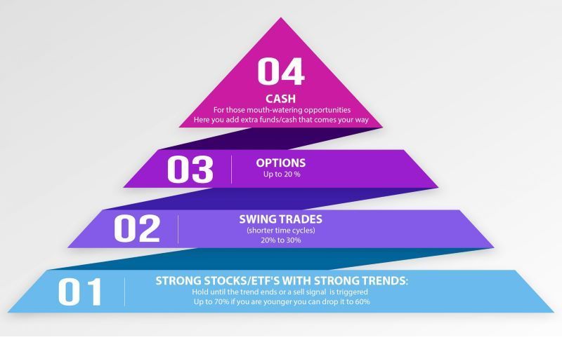
အပိုင်း ၄။ ပိရမစ်ဇယား နမူနာ
Maslow ၏ Hierarchy of Needs
ဤပုံကြမ်းသည် လူသားတို့၏ လိုအပ်ချက်အစီအစဥ်အတိုင်း စွမ်းအင်ပိရမစ်ကို ပြသသည်- အောက်ခြေရှိ အခြေခံလိုအပ်ချက်များနှင့် အထွတ်အထိပ်တွင် မိမိကိုယ်ကို လက်တွေ့လုပ်ဆောင်ခြင်းတို့ကို ပြသထားသည်။ ဧရိယာတစ်ခုစီ၏ အရွယ်အစားသည် လိုအပ်ချက်အမျိုးအစားတစ်ခုစီကို ဖြည့်ဆည်းခြင်း၏ အရေးပါမှု သို့မဟုတ် စိန်ခေါ်မှုကို ညွှန်ပြနိုင်သည်။
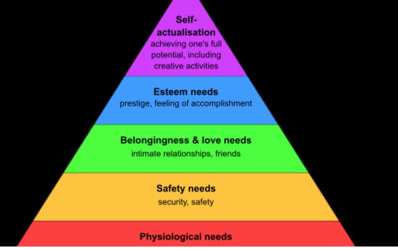
• ထိပ်တန်း- Self-Actualization (လူတစ်ဦး၏ အစွမ်းကုန်အလားအလာကို ရရှိခြင်း)
• ပိုမိုကြီးမားသော ဧရိယာ- လေးစားမှု လိုအပ်ချက်များ (မိမိကိုယ်ကို လေးစားမှု၊ မိမိကိုယ်ကို ယုံကြည်မှု၊ အခြားသူများထံမှ အသိအမှတ်ပြုမှု)
• ပိုကြီးသောဧရိယာ- ချစ်ခြင်းမေတ္တာနှင့် ပိုင်ဆိုင်လိုစိတ်များ (လူမှုရေးအရ ချိတ်ဆက်ခံစားရခြင်း၊ ရင်းနှီးမှု၊ လက်ခံခြင်း)
• အကြီးဆုံး ဧရိယာ- ဘေးကင်းရေး လိုအပ်ချက်များ (လုံခြုံမှု၊ တည်ငြိမ်မှု၊ နေထိုင်ရန် နေရာရှိခြင်း)
• အခြေခံ- အခြေခံလိုအပ်ချက်များ (စားခြင်း၊ သောက်ခြင်း၊ အိပ်ခြင်း၊ အသက်ရှူခြင်း)
အရောင်းလမ်းကြောင်း
ပိရမစ်ဇယားဥပမာသည် အရောင်းလမ်းကြောင်းတစ်ခု၊ ၀ယ်လိုအား သို့မဟုတ် စျေးကွက်ရှာဖွေရေးလမ်းကြောင်းတစ်ခုဖြစ်သည်။ ၎င်းသည် ဖောက်သည်များ စိတ်ဝင်စားမှုမှ ပေးဆောင်သည့် ဖောက်သည်များ ဖြစ်လာခြင်းအထိ လိုက်လျှောက်သည့် လမ်းကြောင်းကို ပြသသည်။ စျေးကွက်ရှာဖွေရေးတွင်၊ ဤစကားစုသည် မတူညီသောဝယ်ယူမှုအဆင့်များမှတဆင့် ရွေ့လျားလာသောအခါ ဖြစ်နိုင်ချေရှိသော ဝယ်သူအရေအတွက် နှေးကွေးသွားခြင်းကို ရည်ညွှန်းသည်။ ထိပ်တွင်ကျယ်လာပြီး အောက်ခြေရှိ အပေါက်ငယ်တစ်ခုအထိ ကျဉ်းသွားသည့် လမ်းကြောင်းတစ်ခုကို စိတ်ကူးကြည့်ပါ။
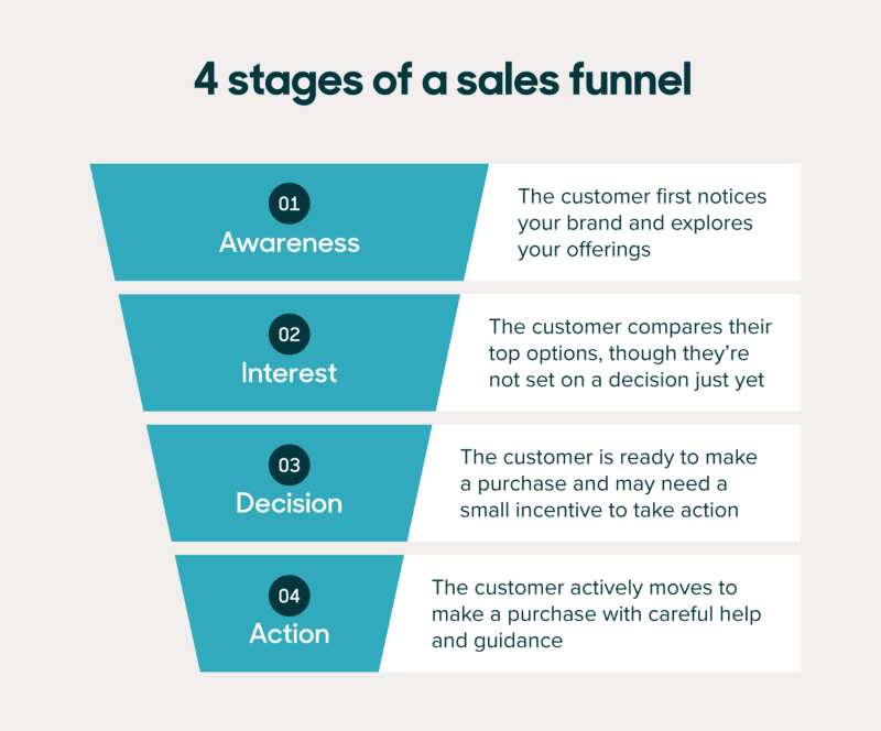
• Top of the Funnel (TOFU): ၎င်းသည် ကျယ်ပြန့်သော ပါးစပ်ကို ကိုယ်စားပြုပြီး ဖြစ်နိုင်ချေရှိသော ဖောက်သည်အုပ်စုကို ညွှန်ပြသည်။
• Middle of Funnel (MOFU)- စျေးကွက်ရှာဖွေရေးဗျူဟာများသည် ဦးဆောင်သူများနှင့် ဆက်ဆံရေးကို ဖော်ဆောင်ရန် အာရုံစိုက်သည်။ ၎င်းတို့သည် သင့်ထုတ်ကုန်၏အားသာချက်များအကြောင်း ဦးဆောင်သူများအား အသိပေးပြီး ၎င်းတို့၏စိုးရိမ်မှုများကို ဖြေရှင်းပေးသည်။
• Bottom of the Funnel (BOFU) : လူတွေ တစ်ခုခုဝယ်တော့မယ့်နေရာအဖြစ် အောက်ခြေမှာရှိတဲ့ သေးငယ်တဲ့ လေဝင်ပေါက်ကို တွေးကြည့်ပါ။
စီမံကိန်းအုပ်ချုပ်မှု
စီမံကိန်းအုပ်ချုပ်မှု ဇယားများသည် မည်ကဲ့သို့ဖြစ်ပျက်နေသည်ကို ခြေရာခံရန်၊ သင်လိုအပ်သောအရာကို စီမံခန့်ခွဲရန်နှင့် ပရောဂျက်တစ်ခု၏အသေးစိတ်အချက်အလက်များအားလုံးကို မျှဝေပေးသည့် ဂရပ်များနှင့်တူသည်။ မတူညီသော အမျိုးအစားများ ရှိပြီး တစ်ခုစီတွင် ၎င်း၏ အထူးအင်္ဂါရပ်များနှင့် ပန်းတိုင်များရှိသည်။ ဒါက အသုံးများတဲ့ ဇယားပုံပါ။

Gantt Chart- ဤဇယားသည် အချိန်နှင့်အမျှ ပရောဂျက်တစ်ခုရှိ အဆင့်များကို ပြသရန် ဘားများကို အသုံးပြုသည်။ ပရောဂျက်၏အချိန်ဇယားကို ပြန်လည်သုံးသပ်ခြင်း၊ မည်သည့်အလုပ်များကို အပြီးသတ်ရန် ဆုံးဖြတ်ခြင်းနှင့် တိုးတက်မှုကို စောင့်ကြည့်ခြင်းတို့အတွက် အလွန်ကောင်းမွန်ပါသည်။
• Horizontal Axis- ပရောဂျက်၏ အချိန်ဇယားကို ပုံမှန်အားဖြင့် ရက်များ၊ ရက်သတ္တပတ်များ သို့မဟုတ် လများအလိုက် ခွဲခြမ်းကာ ပရောဂျက်၏ အချိန်ဇယားကို အမှတ်အသားပြုပါသည်။
• ဒေါင်လိုက်ဝင်ရိုး- ပရောဂျက်တွင်ဖြစ်ပျက်နေသည့်အရာအားလုံးကို သင့်အားစာရင်းပေးသည်။
• ဘားများ- အလုပ်တိုင်းသည် အချိန်ဇယားပေါ်ရှိ ဘားတစ်ခုကို ကိုယ်စားပြုပြီး ဘားများ၏ အရှည်သည် အလုပ်မည်မျှကြာမည်ကို သင့်အား ပြောပြသည်။
• စတင်ချိန်နှင့် ပြီးဆုံးသည့်ရက်စွဲများ- timeline ပေါ်ရှိ ဘား၏တည်နေရာသည် အလုပ်စတင်ချိန်နှင့် ပြီးဆုံးမည့်အချိန်ကို ပြောပြသည်။
ရင်းနှီးမြှုပ်နှံမှု အစုစု
အစုစုပိရမစ်သည် ပုံမှန်ပိရမစ်ဇယားနှင့်တူသည်။ ၎င်းသည် မတူညီသော စွန့်စားရမှုအဆင့်များတစ်လျှောက်တွင် ငွေကြေးမည်ကဲ့သို့ ပျံ့နှံ့ပုံကို ပြသပြီး ဖြစ်နိုင်ချေရှိသော ဆုလာဘ်များနှင့် နှိုင်းယှဉ်ကာ စွန့်စားရနိုင်ခြေနှင့်တူစေရန် ပိရမစ်ပုံစံကို အသုံးပြုထားသည်။
• အန္တရာယ်နည်းပါးခြင်း- ဤကဏ္ဍတွင် ငွေစုအကောင့်တစ်ခုတွင် ငွေထည့်ခြင်း၊ ငွေဈေးကွက်ရန်ပုံငွေများတွင် ရင်းနှီးမြှုပ်နှံခြင်း၊ သို့မဟုတ် ကာလတိုအစိုးရငွေချေးစာချုပ်များ ဝယ်ယူခြင်းတို့ ပါဝင်သည်။
• အလယ်အလတ်အန္တရာယ်- ဤအပိုင်းတွင် ကုမ္ပဏီငွေချေးစာချုပ်များ၊ အမြတ်ဝေစုပေးသော စတော့ရှယ်ယာများ သို့မဟုတ် အပြန်အလှန်ရန်ပုံငွေများ ပါဝင်နိုင်သည်။
• မြင့်မားသောအန္တရာယ်- ဤသည်မှာ အန္တရာယ်အရှိဆုံးအပိုင်းဖြစ်သည်။ ၎င်းတွင် လျင်မြန်စွာ ကြီးထွားနေသော ကုမ္ပဏီများ၊ အိမ်ခြံမြေများတွင် ရင်းနှီးမြှုပ်နှံသည့် ရန်ပုံငွေများ သို့မဟုတ် ကုန်စည်စီးဆင်းမှုများ ရှိနိုင်သည်။
အပိုင်း ၅။ MindOnMap ဖြင့် ပိရမစ်ဇယားကို ဖန်တီးနည်း
MindOnMap သည် အသုံးပြုရလွယ်ကူသည်။ mind-mapping လျှောက်လွှာ။ ၎င်းသည် သင့်အား အသိပေးသည့် အမြင်အာရုံစူးစိုက်မှုရှိသော ပိရမစ်ဇယားများကို ဖန်တီးနိုင်စေပါသည်။ ဤသည်မှာ သင်စတင်ရန် ကူညီရန် အသေးစိတ်လမ်းညွှန်ချက်ဖြစ်သည်-
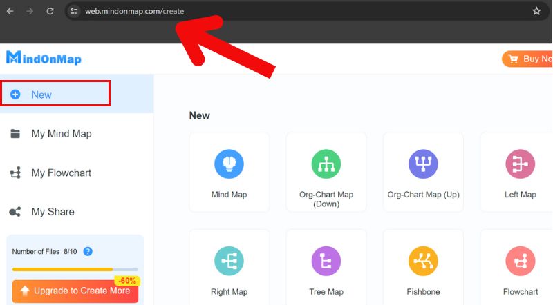
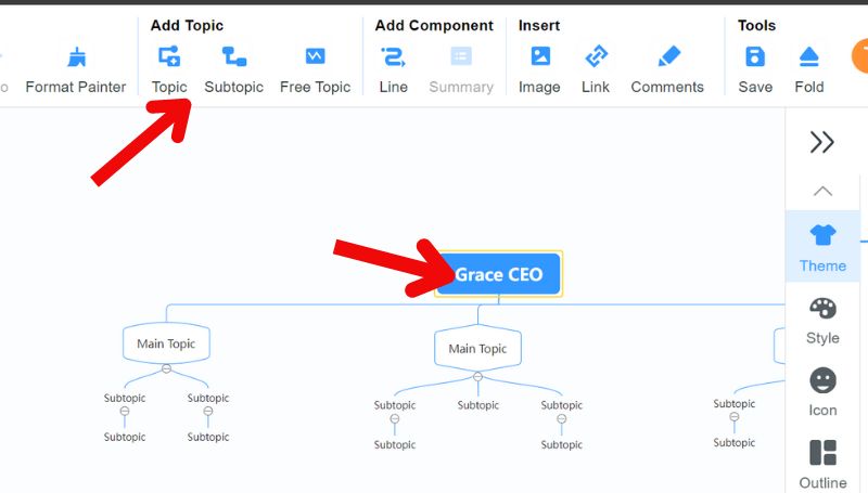
MindOnMap ကိုဖွင့်ပြီး စိတ်မြေပုံအသစ်တစ်ခုစတင်ရန် ရွေးချယ်မှုကို ရွေးချယ်ပါ။
စိတ်ကူးပုံဖော်ခြင်းကိရိယာများစွာသည် အမျိုးမျိုးသောအသုံးပြုမှုအတွက် ကြိုတင်ပြုလုပ်ထားသည့် အပြင်အဆင်များပါရှိသည်။ Org-Chart Map (အောက်) ကဲ့သို့ တြိဂံပုံသဏ္ဍာန်ရှိသော ဒီဇိုင်း သို့မဟုတ် ပုံစံခွက်ကို ရှာပါ။
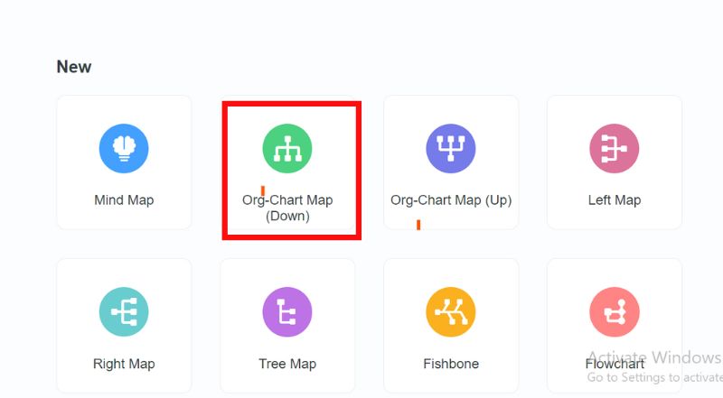
ပိရမစ်တစ်ခုပြုလုပ်ရန် ပုံသဏ္ဍာန်များကို သင်စတင်အသုံးပြုနိုင်သည်။ အများအားဖြင့်၊ သင့်လိုအပ်ချက်များနှင့်ကိုက်ညီစေရန် ပိရမစ်ရှိ အပိုင်းအရေအတွက်ကို ချိန်ညှိပါ။
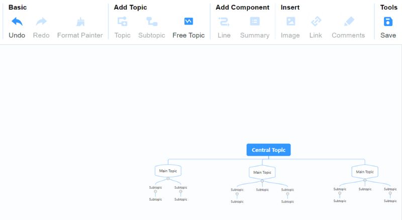
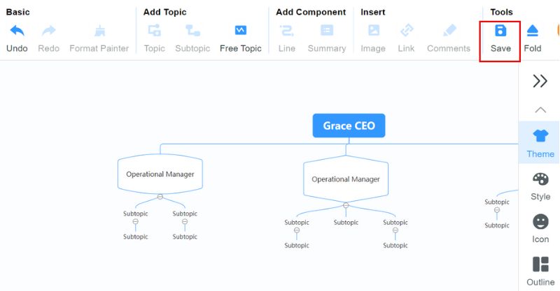
ပိရမစ်၏ အစိတ်အပိုင်းတစ်ခုစီသို့ စာသားထည့်ပါ။ Add Topic၊ Subtopic နှင့် Free Topic ခလုတ်များကို နှိပ်ခြင်းဖြင့် ၎င်းကို ပြုလုပ်ပါ။ အမျိုးအစားအမည်များ၊ လုပ်ငန်းစဉ်အဆင့်များ သို့မဟုတ် သင်မီးမောင်းထိုးပြလိုသော အရေးကြီးသောအချက်များထည့်ရန် ၎င်းတို့ကို အသုံးပြုပါ။
သင်၏ ပိရမစ်ဇယား ပြီးသည်နှင့်၊ သင်သည် ၎င်းကို တင်ဆက်မှု သို့မဟုတ် အစီရင်ခံစာများအတွက် ပုံတစ်ခုအဖြစ် ထုတ်ယူနိုင်သည်။
အပိုင်း ၆။ ပိရမစ်ဇယားနှင့်ပတ်သက်သော FAQs
ပိရမစ်ပုံကြမ်းတစ်ခု၏ ရည်ရွယ်ချက်ကား အဘယ်နည်း။
ပိရမစ်ဇယားများသည် ရှုပ်ထွေးသောအဖွဲ့အစည်းများ၊ နည်းလမ်းများနှင့် တိုးတက်မှုများကို အတိုချုပ်ပြပြီး ဆွဲဆောင်မှုရှိသည်။ ၎င်းတို့သည် တင်ဆက်မှုများပေးခြင်း၊ အင်ဖိုဂရပ်ဖစ်များအဖြစ် အစီရင်ခံစာများဖန်တီးခြင်းနှင့် ဦးနှောက်ဖောက်ထွက်ခြင်းဆိုင်ရာ ဦးဆောင်အစည်းအဝေးများအတွက် အရေးကြီးသောအရင်းအမြစ်တစ်ခုဖြစ်သည်။
ပိရမစ်ဇယားနှင့် funnel chart အကြား ကွာခြားချက်ကား အဘယ်နည်း။
၎င်း၏အဓိကတွင်၊ ပိရမစ်ဇယားများသည် အထက်တန်းနှင့် အစီအစဥ်များကို ပြသသည်။ လုပ်ငန်းစဉ်တစ်ခုအတွင်း အချက်အလက် ရွေ့လျားနေချိန်တွင် လမ်းကြောင်းဇယားများသည် အရေအတွက် သို့မဟုတ် ပမာဏ မည်ကဲ့သို့ လျော့နည်းသွားသည်ကို မီးမောင်းထိုးပြသည်။
ပိရမစ်ဇယား၏ အဓိပ္ပာယ်ဖွင့်ဆိုချက်ကား အဘယ်နည်း။
ပိရမစ်ဇယားသည် အလွှာလိုက်ဖွဲ့စည်းပုံများ၊ အချိုးများနှင့် မော်ဒယ်များကိုပြသသည့် လိုက်လျောညီထွေရှိသောကိရိယာတစ်ခုဖြစ်သည်။ ၎င်းသည် စနစ်အစိတ်အပိုင်းများ၏ အရေးပါမှုနှင့် အခြေခံအင်္ဂါရပ်များကို အလေးထားပြီး နယ်ပယ်များစွာတွင် ပြသရန်၊ လေ့လာခြင်းနှင့် စီစဉ်ခြင်းအတွက် အဓိကကိရိယာတစ်ခုဖြစ်လာသည်။
နိဂုံး
တစ် ပိရမစ်ဇယား ဒေတာအဆင့်ဆင့်မှတစ်ဆင့် ပရိသတ်ကို ပို့ဆောင်ပေးသည့် ရုပ်မြင်သံကြားစက်လှေကားတစ်ခုဖြစ်သည်။ နေရာတော်တော်များများမှာ အလုပ်လုပ်ကြတယ်။ ၎င်းတို့သည် ရှုပ်ထွေးသောအချက်အလက်များကို ရိုးရှင်းစေပြီး ပိုမိုဆွဲဆောင်မှုဖြစ်စေသည်။ ပိရမစ်ဇယားများသည် အလားအလာရှိသည်။ ၎င်းတို့ကို ဖန်တီးရန် သင်ယူခြင်းဖြင့်၊ ၎င်းတို့ကို အကြံဥာဏ်များ မျှဝေရန်နှင့် သင်၏ ဆွေးနွေးချက်များ၊ အစီရင်ခံစာများနှင့် အုပ်စုဆွေးနွေးမှုများကို တိုးတက်စေရန် ၎င်းတို့ကို အသုံးပြုနိုင်သည်။