Mahaiko inbutu diagramak menperatzea: urratsez urrats gida
Mahaia tresna bikaina da xehetasun konplikatuak ikusteko eta kudeatzeko. Jendeari ereduak ikusten eta erabaki adimentsuak hartzen laguntzen dio datuak ulertzeko errazago bihurtuz. A Mahai-inbutu-diagrama prozesu batean informazioa urrats batetik bestera nola mugitzen den erakusten duen taula da. Inbutu-diagramak Tableaun bikainak egiten dituena arrastatu eta jaregin diseinu erraza da, diagrama pertsonalizatzeko aukerak, hainbat datu-iturrirekin lan egiteko gaitasuna, interaktibitatea eta datuak aldatzen diren heinean denbora errealean eguneratzen direla. Tableau-ren inbutu-diagrama funtzioa erabiliz, erabiltzaileek datuak erraz aztertu, arazoak aurkitu eta prozesuak hobe ditzakete.

- 1. zatia. Zer da taula
- 2. zatia. Sortu inbutu-diagrama taulan
- 3. zatia. Mahaia erabiltzearen alde onak eta txarrak Inbutuaren diagrama egiteko
- 4. zatia. Bide alternatibo onena- MindOnMap
- 5. zatia. Mahaian inbutu-diagrama sortzeko galderak
1. zatia. Zer da taula
Tableau-ko inbutu-diagrama goi-mailakoa da datuak modu cool eta ulerterraz batean erakusteko. Datu gordinak interesgarri eta itxura bikaina duen zerbait bihurtzen ditu. Konfigurazioa erraza da, eta, beraz, oraindik ikasi ahal izango duzu, nahiz eta datuen zalea ez izan. Guztiek datuetan murgiltzea bikaina egiten du. Agertzen diren ereduak antzeman ditzakezu eta aurkitzen duzunaren arabera erabaki adimentsuak har ditzakezu.
Tableauk funtzio nagusien multzoa eskaintzen du, besteak beste:
• Egin bistaratze politak kodeketa konplikaturik egin beharrik gabe.
• Eraiki panel interaktiboak. Jendeari datuak ikuspuntu ezberdinetatik aztertzen uzten diote.
• Lotu datu-iturri askorekin. Kalkulu-orriak, datu-baseak eta lineako biltegiratzea biltzen ditu.
• Mantendu zure bistaratzeak eguneratuta datu berrienekin.
• Era askotako taulak, grafikoak eta mapak sortzea. Pertsonalizatu behar duzunera egokitzeko.
2. zatia. Sortu inbutu-diagrama taulan
Erabiltzeko erraza den Tableau tresnarekin, zure datuak inbutu-diagrama zoragarrietan nola eraldatzen erakutsiko dizugu. Atal honetan, inbutu-diagrama nola sortzen ikasiko duzu Tableau-n, itxura polita duena eta zure datuak ulertzea errazten dizuna. Presta zaitez Tableau-rekin inbutu grafiko dinamiko eta politak egitearen dibertsiora salto egiteko.
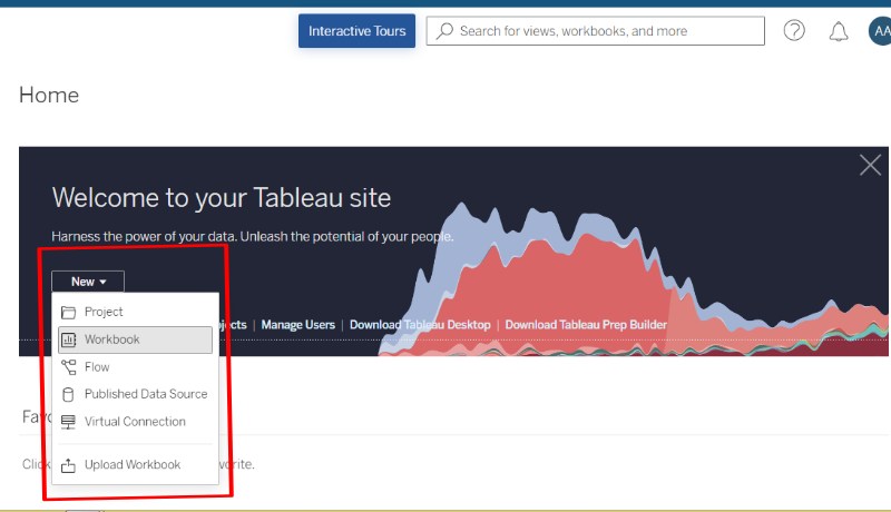
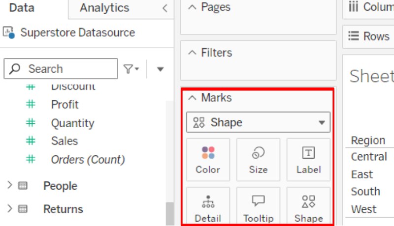
Abiarazi tresna, hautatu Berria eta, ondoren, egin klik Lan-koadernoan. Ziurtatu zure datuak behar bezala egituratuta daudela. Zure inbutuaren faseak adierazten dituen dimentsio bat izan beharko zenuke (adibidez, Beruna, Aukera, Bezeroa) eta etapa bakoitzean kantitatea adierazten duen neurri bat.
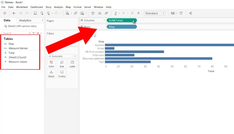
Arrastatu zure eszenatokiaren dimentsioa Rows apalera. Arrastatu zure kantitatearen neurria Zutabeen apalategira. Oinarrizko barra-diagrama bat sortuko du. Egin klik eskuineko botoiarekin ikuspegian eta hautatu Ikuspegi osoa. Diagrama zabalduko du lan-orriaren eremu osoa betetzeko.
Kopiatu zure zenbakia gainean eskuineko botoiarekin klik eginez eta Bikoiztu hautatuta. Aldatu kopiatutako zenbakia zenbatzen duzun Zenbaketa edo Batura gisa, zure datuetarako behar duzunaren arabera. Egin klik eskuineko botoiarekin zenbakiaren alboan eta aukeratu Editatu Ardatza. Egiaztatu Alderantzizko botoia.
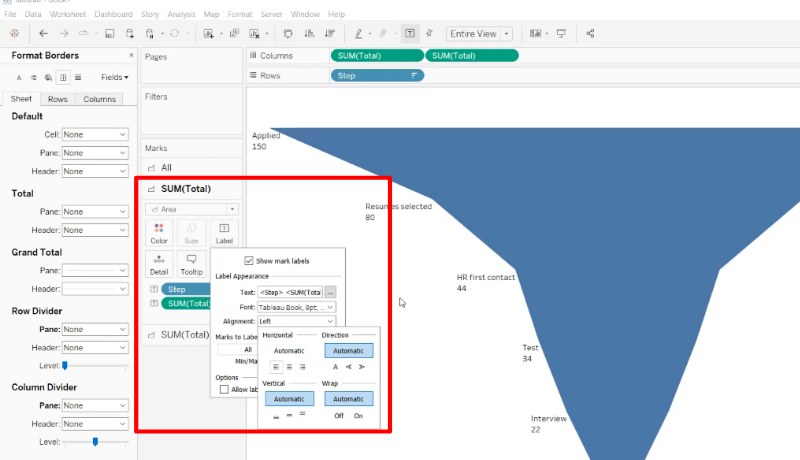
Eraman bi zenbakiak Zutabeen apalategira. Tableauk automatikoki konfiguratuko du bi ardatz dituen diagrama. Jolastu koloreekin, etiketekin eta gauzek nola itxura duten zure inbutu-diagrama hobeto ikusteko. Demagun tresna-aholkuak gehitzea grafikoaren gainetik pasatzean informazio gehiago emateko. Halaxe da egin inbutu-diagrama taulan. Horrela sortu inbutu-diagrama Tableau-n.
3. zatia. Mahaia erabiltzearen alde onak eta txarrak Inbutuaren diagrama egiteko
Inbutu diagrametarako Tableau erabiltzearen abantailak:
• Erabiltzeko erraza: arrastatu eta jaregiteko konfigurazio sinplea du, hasiberriek ere jabetu ahal izateko.
• Aniversaria: zure beharretara egokitzeko, koloreak aldatzeko eta etiketak gehitzeko, adibidez.
• Interaktiboa: datuetan sakontzeko aukera ematen dizu.
• Iturri askotara konektatzen da: ikuspegi zabala ematen dizu.
• Eguneratzeak berehala: diagramek azken informazioarekin jarraitzen dute.
• Istorioak ondo kontatzen ditu: istorio bisual liluragarriak sortzen ditu.
Inbutu diagrametarako Tableau erabiltzearen desabantailak:
• Zaila eskuratzea: funtzio konplikatuagoek ikasteko denbora gehiago behar izan dezakete.
• Big Data-rekin moteldu: datu askorekin lan egiteak gauzak motelago mugi ditzake.
• Lizentzia garestiak: lizentziak erostea garestia izan daiteke, batez ere talde handientzat.
• Erabiltzeko tresna bakarra: jendea taulan oinarritzen da gauzak egiteko eta ikusteko.
Tableau, zalantzarik gabe, tresna indartsua da inbutu-diagrama erakargarriak sortzeko. Erabiltzeko erraza den diseinuak eta pertsonalizazio funtzio askok bezeroak erakartzen dituzte. Tamaina guztietako enpresetatik datoz. Hala ere, nola funtzionatzen duen desberdina izan daiteke datuen konplexutasuna eta erabiltzailearen eskakizun zehatzen arabera. Tableau bereziki erabilgarria iruditu zait salmentak eta beste gertaera esanguratsu batzuk dituzten kasuetarako. Informazio guztia batzea erabakigarria izan zen niretzat erraz ulertzeko moduko irudi bat sortzeko. Hala ere, kolpe batzuk jo ditut datuak tresnan bat egitean. Oro har, Tableau tresna bikaina da datuak irudi bihurtzeko. Baina funtsezkoa da bere alde onak eta txarrak beste aukeren aurrean baloratzea, zure beharretara egokitzen dena aukeratzeko.
4. zatia. Bide alternatibo onena- MindOnMap
MindOnMap Buru-mapak eta diagramak egiteko lineako tresna ikaragarria da, datuak bisualki erraz erakustea errazteko. Ezaguna da adimen mapak egiteko tresnak zein sinpleak diren. Diagrama asko sor ditzakezu, adibidez inbutu-diagramak, eta aukera bikaina da inbutu-diagrametarako, ikasteko erraza delako, nahiz eta hasi berria zaren. Gainera, zure diagramak egiteko aukera ematen dizu, beraz, zure inbutuaren diagramak nahi duzun bezala pertsonaliza ditzakezu. Inbutu-diagramak elkarrekin lan egin ditzakezu denbora errealean, eta hori bikaina da talde-proiektuetarako. Datuen analisian sakontzeko Tableau-ren ezaugarri dotore guztiak ez dituen arren, MindOnMap aukera ona da oinarrizko eta erdi mailako inbutu grafikoetarako, erabiltzeko erraza, polifazetikoa eta merkea delako. Zure beharretarako estalita daukazu.
Ireki zure web arakatzailea eta bilatu MindOnMap bilaketa-eremuan. Hori egin ondoren, hasi proiektu berri bat zure lana eraikitzen hasteko.
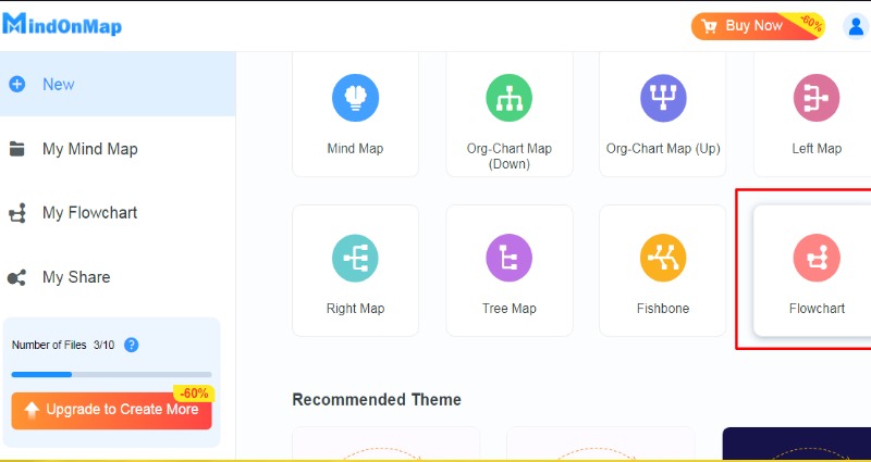
Aukeratu fluxu-diagramako gai bat, aukeratu laukizuzen bat eta moldatu zure gustura. Inbutu bat dirudi.
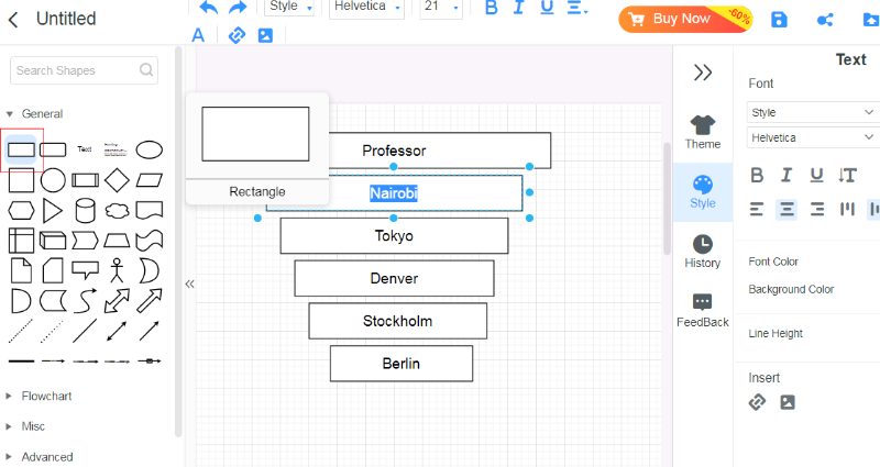
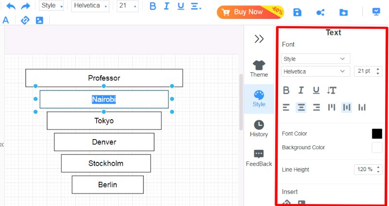
Egin klik laukizuzenean zure informazioa sartzen hasteko. Eskuineko panelak testua aldatzeko aukera ematen dizu bere tamaina eta itxura doituz.
5. zatia. Mahaian inbutu-diagrama sortzeko galderak
Zein da inbutu-diagrama baten erabilera nagusia Tableau-n?
Tableau-ko inbutu-diagrama batek hainbat fasetako prozesuetan datuak nola mugitzen diren erakusten laguntzen du. Oso egokia da salmenta-bideak, bezeroen urratsak eta marketin-fluxuak aztertzeko. Etapa bakoitzean zenbat datu dagoen erakusten du, arazoak antzematen eta aldaketak non behar diren ikusten lagunduz. Adibidez, salmenten inbutu-diagrama batek bezeroek prozesua non uzten duten adierazi dezake, arlo horiek hobetzen lagunduz.
Nola egin dezaket inbutu-diagrama konplexu bat Tableau-n?
Sartu eremu bereziak zenbat pertsona bihurtzen diren edo batez beste zenbat denbora behar duen neurtzeko modu berriak garatzeko. Erabili ezarpenak datuetan errazago murgiltzeko. Idatzi oharrak gauzak hobeto azaltzeko eta puntu garrantzitsuak seinalatu. Probatu bi lerro dituzten grafikoak, gauzak nola alderatzen diren ikusteko. Pertsonalizatu itxura behar duzunarekin bat etortzeko. Gehitu erabiltzaileei gehiago sakondu eta datuak iragazteko aukera ematen dieten funtzioak, esperientzia leunagoa izateko. Tresna hau bat sortzeko ere erabil dezakezu armiarma diagrama.
Inbutu-diagrama taulan adibidearekin
Inbutu-diagramak salmenta-prozesu bat erakusten du normalean, Leads, Aukerak eta Bezeroak bezalako urratsekin. Inbutua argala bada, esan nahi du ez duela jende asko sartzen, eta horrek esan nahi du arreta behar duen arazo edo zatiren bat dagoela. Joera horiei erreparatuz, negozioak arlo horiek hobetzen kontzentratu daitezke.
Ondorioa
Inbutu-diagrama taulan urrats askorekin prozesu konplikatuak ikustea eta kudeatzea errazten du. Taula bikaina da, erabiltzeko erraza delako eta funtzio eder asko dituelako, eta, beraz, grafiko hauek sortzeko aukera nagusia da. Jendeak bere datuetatik asko ikas dezake oinarrietatik hasi eta teknika aurreratuagoetara pasatuz. Hala ere, grafiko sinpleak behar badituzu edo beste batzuekin lanean ari bazara, MindOnMap egokiagoa izan daiteke. Erabiltzeko tresna egokia zure datuak zein konplexuak diren, pertsonalizatu behar dituzun ala ez eta zer behar zehatz dituzun araberakoa da. Tresna ezberdinen puntu onak eta txarrak ulertzeak jendeari eta taldeei euren beharretarako egokiena aukeratzen laguntzen die. Tableau eta MindOnMap artean aukeratzea funtsezkoa da inbutu-diagrama argi eta eraginkorrak egiteko, eta horiek garrantzitsuak dira datuetan oinarritutako erabaki adimentsuak hartzeko.