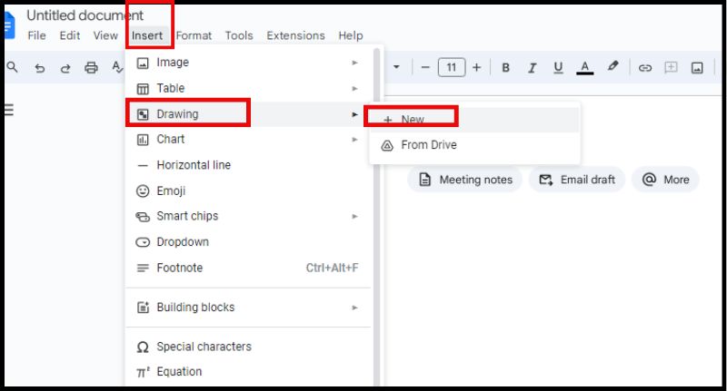
Tresna desberdinetan piramide-diagramak sortzeko urratsak
Inoiz behar izan al duzu datu konplexuak modu ulergarri eta erakargarri batean aurkeztu? Gida lagungarri honek trebetasunak eta argibideak emango dizkizu sortu piramide-diagrama plataforma ezberdinetan. MindOnMap-i begira hasiko gara, ideia-jasa egiteko tresna bikaina. MindOnMap-ekin zure informazioa ikusteak oinarri sendo bat eraikitzen du. Piramide-diagrama eraginkorrak egiten ditu. Ondoren, piramide-diagramak egiteko prozesuan murgilduko gara Microsoft Excel, Microsoft Word, Google Sheets, Google Docs eta Microsoft PowerPoint-en. Gida honen amaieran, piramide-diagramak egiten aditua izango zara. Zure datu hierarkikoak ondo erakusten dituzte plataforma askotan. Presta zaitez zure datuak bisual argi eta erakargarri bihurtzeko!

- 1. zatia. Sortu piramide-diagrama MindOnMap-ekin
- 2. zatia. Egin piramide-diagrama Excel-en
- 3. zatia. Nola egin piramide-diagrama Google Docs-en
- 4. zatia. Egin piramide-diagrama Google Sheets-en
- 5. zatia. Nola egin piramide-diagrama PowerPoint-en
- 6. zatia. Egin piramide-diagrama Word-en
- 7. zatia. Piramide-diagrama nola sortu buruzko galderak
1. zatia. Sortu piramide-diagrama MindOnMap-ekin
Nahiz eta MindOnMap ezin dira taulak bakarrik egin, piramideen diagramak egiteko lehen urrats ona da. Beste tresna askorekin erabil dezakezu. MindOnMap-en piramide-diagrama nola sortzen ikastea zure ezkutuko bateko bihur daiteke. MindOnMap adimen mapak egiteko diseinatutako softwarea da, datuak bisualki pentsatu eta antolatzeko aukera ematen dizuna. Azpigaiak eta zehaztapenak eratorritako gai nagusi bat erakusten du, horrela zure datu-egituraren irudikapen bisual bat osatuz.
Deskarga segurua
Deskarga segurua
Ezaugarri nagusiak
• Irudi handia ikusten eta zure datuen hierarkia antolatzen laguntzen dizu diagrama sortu aurretik.
• Piramide-egitura argia eta ondo antolatua sustatzen du, dena bisualki ezarriz.
• Datu-puntuak eta hierarkian kokatzea sustatzen du.
• Gai nagusia eta zatiketa
• Osagai bisual erakargarriak (ñabardurak, ikurrak, irudiak)
• Antolakuntza Egitura Ez Sekuentziala
PROS
- Perspektiba orokorra ulertzeko eta falta diren elementuak antzemateko aukera ematen dizu.
- Piramide-diagrama argi eta ordenatua sortzea errazten du.
- Pentsamendu sortzailea bultzatzen du. Era berean, datu-puntu asko eta hierarkian dituzten posizioak aztertzea eskatzen du.
- Elkarlan errazerako diseinatuta dago. Taldekideei elkarrekin lan egiteko aukera ematen die piramidea egituratzeko eta ideia-jasa egiteko.
KONTRA
- Ez du zuzeneko grafikoen sorrerarik egiten.
- Bere ikusmen pertsonalizatzeko aukerak grafikoen software espezializatuan daudenak baino zabalagoak dira.
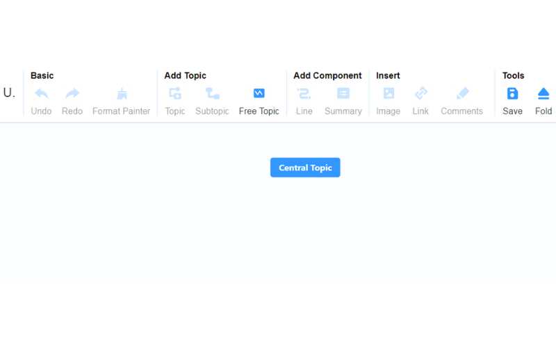
Hasi proiektu berri bat MindOnMap irekiz eta Sortu zure buru-mapa edo Sortu linean aukera hautatuz. Oinarrizko gaia: oinarrizko atalean, sartu zure buru-maparako kontuan hartzen ari zaren ideia edo gai nagusia. Zure sorkuntzaren oinarri gisa balioko du.

Joan panelera + Berria hautatuz, non hainbat diseinu bistaratzen diren. Organigramaren mapa (Behera) edo Organigramaren mapa (Gorantz) aukera dezakezu. Aukera egitean, edizio-panelera sartuko zara.

Hautatu organigrama (behean) eskema ikusteko. Nahiago duzun gaia hauta dezakezu eta diseinu berdina jaso dezakezu Iradokitako Gaian. Ondoren, edukia eta diseinua zure gustura alda ditzakezu.
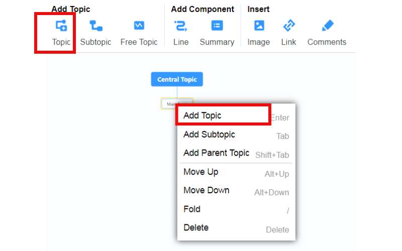
Egin klik eskuineko botoiarekin sagua eta hautatu Gehitu gaia laster-menuan. Bestela, tresna-barraren goiko aldean dagoen Gaia sakatu dezakezu.
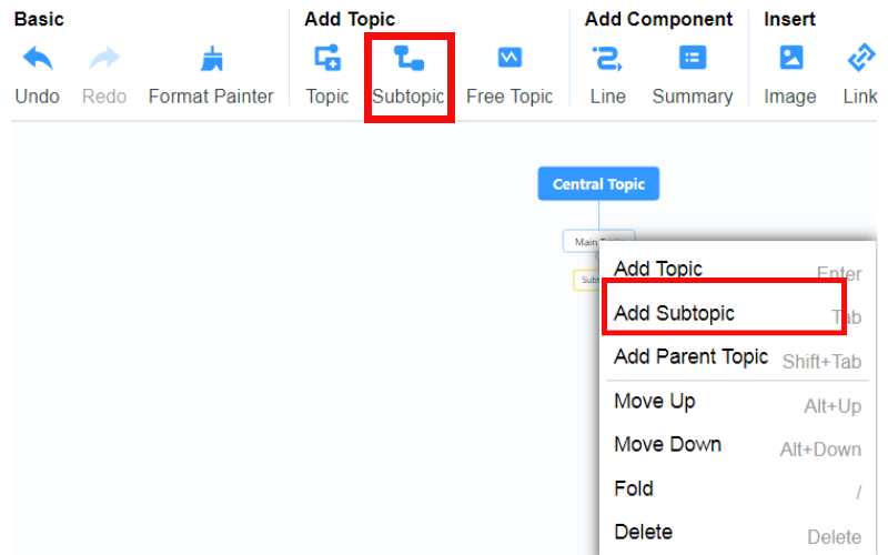
Azpigai gehigarriak sartzeko, bete ezazu erlazionatutako gaiaren atalean zehazten diren urratsak. Egin klik eskuineko botoiarekin eta aukeratu Gehitu azpigaia. Bestela, hautatu Azpigaia goiko tresna-barran.
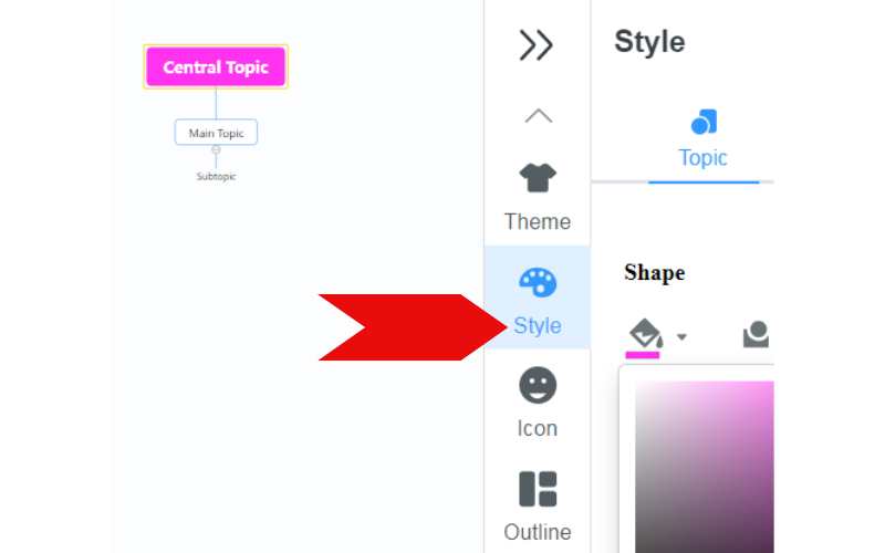
Zure diagramaren lerroa, laburpena, irudiak, esteka, iruzkinak eta ikonoa pertsonaliza ditzakezu eta bere estiloa alda dezakezu. Editatu ondoren, partekatu klik egin dezakezu goiko eskuineko izkinan. Markatu Pasahitzak laukia, eta zuk zeuk alda dezakezu. Ondoren, sakatu Kopiatu esteka eta pasahitza eta partekatu esteka besteekin.
2. zatia. Egin piramide-diagrama Excel-en
Excel-en piramide-diagrama bat sortu nahi al duzu ahalegin minimoarekin? SmartArt graphics tresna integratua da. Piramide grafiko deigarriak egiteko modu erraz bat eskaintzen du. Formatu konplikatuei aurre egin gabe egin ditzakezu. SmartArt zure aukerarik onena da piramide-diagrama bat sortzeko presarik baduzu aurkezpenak edo txostenak. Piramide grafiko erakargarriak egiteko modu erraz bat eskaintzen du. Hona hemen Excel-en piramide-diagrama bat egiteko urratsak.
PROS
- Piramide-diagramek modu egokian erakusten dute datu-egitura hierarkikoa modu ikusgarri batean.
- Hainbat motatako piramide-diagramak egiteko aukera eskaintzen du zure datuen izaera eta eskakizunetan oinarrituta.
- Diagramaren itxuraren gaineko kontrol handiagoa ahalbidetzen du. Horrek koloreak, tipografia eta datu-puntuak erakusteko estiloa aukeratzen ditu.
KONTRA
- Pilatutako zutabe-diagrama metodoak eskaintzen dituen pertsonalizazio aukera zabalak behar dira.
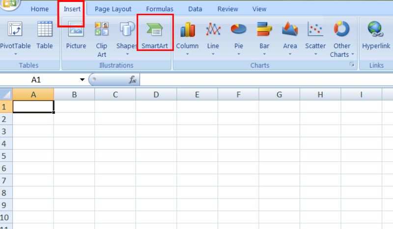
Joan zure piramidearen grafikoa agertzea nahi duzun kalkulu-orrira. Egin klik Txertatu aukera Excel tresna-barraren goiko aldean. Bilatu Ilustrazioak eremua eta hautatu SmartArt aukera.
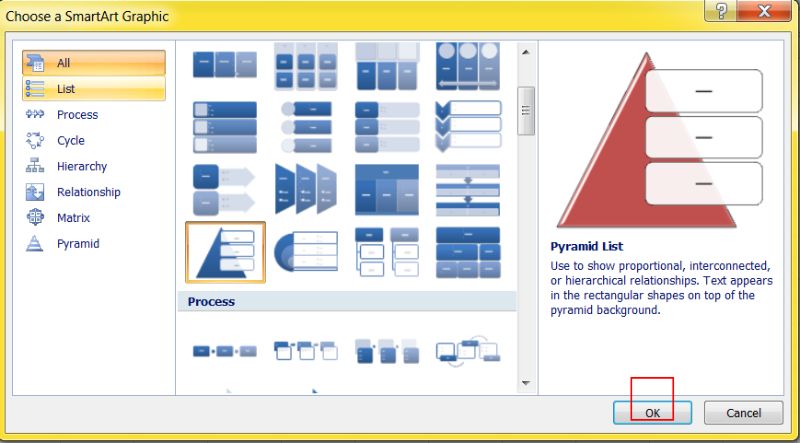
Ezkerreko atalean, hautatu Piramide aukera. Arakatu pantailan dauden piramide-diseinu desberdinak, guztiak itxura ezberdinekin. Aukeratu zure beharretara egokitzen den eredua.
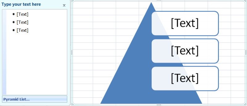
Aukeratutako piramidearen diseinua zure kalkulu-orrian agertuko da. Piramidearen atal guztietan testua agertuko da. Jarri koadro faltsu bakoitzaren datu-etiketak saguarekin hautatuz.
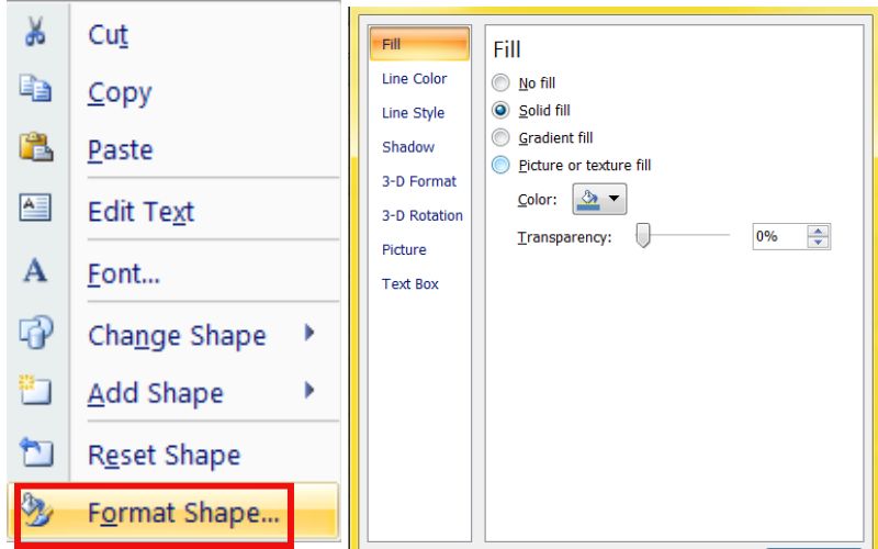
Piramidean eskuineko botoiarekin klik egiteak Formatu forma hautatzera eramango du. Formatu forma leiho berri bat piztuko du Excel leihoaren eskuinaldean. Arakatu Bete eta Lerro fitxak diagramaren koloreak eta ertz-estiloak aldatzeko. Gainera, piramide-taulan testuaren tamaina, forma eta kolorea alda ditzakezu. Egin hau Excel zintako formatu-aukerak erabiliz.
Zure piramide-diagramaren itxurarekin pozik bazaude, haren dimentsioak eta kokapena doi ditzakezu lau ertzak mugituz. Diagramari izenburua ere eman diezaiokezu piramidearen barruan klik eginez eta zure izenburua idatziz.
3. zatia. Nola egin piramide-diagrama Google Docs-en
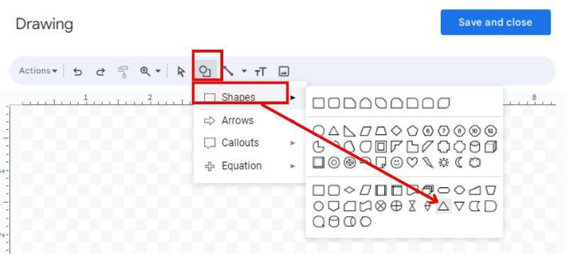
Google Docs-ek piramide-diagramak egiteko tresna espezifikorik ez badu ere, ez dago kezkatu beharrik! Arazoak konpontzeko sormenari eta Google Docs marrazkiari esker, piramide-diagramak egin ditzakezu oraindik. Planteamendu honek Google Docs-en marrazki-eginbideen moldagarritasuna aprobetxatzen du. Piramide forma sortzeko, lerroak eta triangeluak erabiliko dituzu eta, ondoren, testu-koadroak sartuko dituzu egituraren maila bakoitza izendatzeko. Hona hemen nola egin piramide-diagrama Google Docs-en.
PROS
- Erraz eskura daiteke inolako kuotarik gabe, eta horrek erakargarritasuna gehitzen du.
- Askatasun osoa duzu piramidea moldatzeko, haren ñabardura aldatzeko eta testuaren estiloa doitzeko.
KONTRA
- Ikuspegi erakargarria den piramide grafiko bat lantzeko denbora gehiago behar izan daiteke ikuspegi honen bidez.
- Ez eman plataforma desberdinetan grafikoki erakusten duen interaktibitate maila.
Joan zure Google Drive-ra eta hasi Google Doc berri bat edo kargatu piramide-diagrama gehitzeko asmoa duzun lehendik dagoen bat.
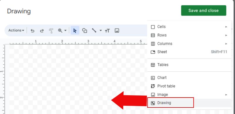
Hautatu Txertatu aukera zerrendaren goialdean, aukeratu Marrazkia eta gehitu + Berria. Marrazkiak sortzeko bereziki leiho bat irekiko du.
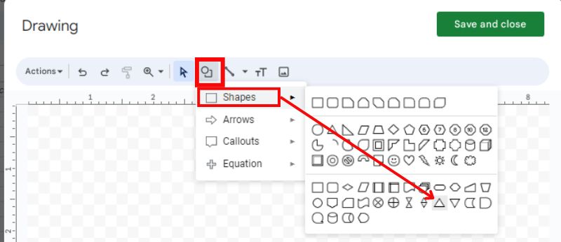
Bilatu formak, eta hautatu triangelu-diagrama automatikoki marrazteko. Jolastu koloreekin.
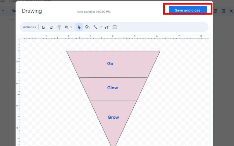
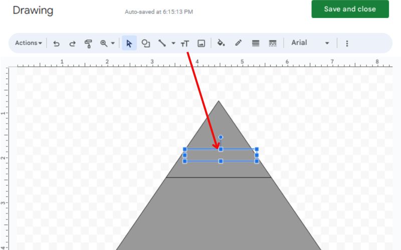
Hautatu Testu-koadroa eginbidea eta mugitu marrazketa-espaziora testu-koadro bat osatzeko. Testu-koadroaren barruan, idatzi dagokion piramide-geruzaren etiketa. Egin hau zure piramide egiturako maila bakoitzean.
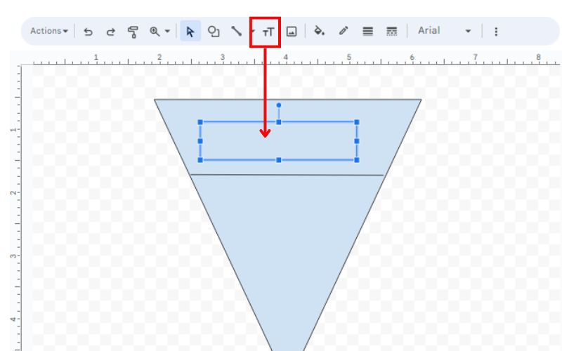
5. urratsa. Doitu testu-koadroen eta piramide-formen dimentsioak, posizioa eta kolorea marrazteko tresnak erabiliz.
6. urratsa. Zure piramide-diagramarekin pozik egon ondoren, egin klik Gorde eta Itxi marrazki tresnan zure aldaketak ezartzeko.
4. zatia. Egin piramide-diagrama Google Sheets-en
Google Kalkulu-orriak lagun zaitzake egin organigrama, erregaien taula, barra-diagrama, etab. Google Sheets-ek piramide-diagramak sortzeko funtzionalitate zuzenik ez badu ere, metodo berritzaile batek pilatutako barra-diagramak erabiltzen ditu. Metodo honek pilatutako barra-diagrama bat osatu behar du eta gero aldatzea piramide baten itxura izateko. Datuak arretaz antolatzen ditu eta tabernen tamaina doitzen du. Google Docs bezalako marrazketa tresnak ere erabil ditzakezu. Planteamendu honek zure Google Sheet-en elementu grafiko bat egitea eta piramide forma bat imitatzeko aldatzea dakar. Gainera, hobetu dezakezu informazioa etiketatzeko testu-ontziak sartuz. Hona hemen nola egin piramide-diagrama Google Sheets-en.
PROS
- Zure diagramaren itxura pertsonaliza dezakezu koloreak, letra-tipoak eta datu-puntuak nola bistaratzen diren aukeratuz.
- Diagramak Google Docs-en egindako piramide-diagramak baino interaktiboagoak dira.
KONTRA
- Piramide forma perfektua lortzeak datuak eta barren zabalera doitzea suposa dezake.
Kasu honetan, marrazteko tresna erabiliko nuke.
Joan zure piramide-diagrama jarri nahi duzun gelaxkara. Hautatu Txertatu eta egin klik Marrazkia. Marrazki leiho gehigarri bat agertuko da.
Marraztu hainbat tamainatako triangelu, geruzak jarriz piramideari forma emateko. Triangeluen itxura alda dezakezu (kolorea, marra-zabalera) ukitu pertsonal baterako.
Aktibatu Testu-koadroa funtzioa eta kokatu zure piramidean nahi duzun lekuan. Sartu maila zehatz horretarako hierarkiaren datuen etiketa. Errepikatu urrats hau maila bakoitzerako.
Erabili marrazteko tresnak formen eta testu-koadroen tamaina, posizioa eta kolorea aldatzeko. Egin hau piramide simetriko baterako zuzen lerrokatzen direla ziurtatzeko. Hautatu Gorde eta Itxi krokis leihoan zure lanarekin gustura bazaude.
5. zatia. Nola egin piramide-diagrama PowerPoint-en
PowerPoint-ek bi estrategia nagusi eskaintzen ditu piramide-diagrama onak egiteko. SmartArt grafikoak eta pilatutako zutabe-diagramak dira. Aurrera diezaiogun SmartArt. Teknika honek aukera azkarra eta zuzena eskaintzen du piramide-diagrama sinpleetarako. Aurrez egindako txantiloietatik hauta ditzakezu eta zure datuetara egokitu ahal izango dituzu. Hona hemen PowerPoint-en piramide-diagrama nola egin.
PROS
- Lan gutxiago da eta azkarrago jar daiteke martxan, batez ere oinarrizko piramide-diagrametan.
- Aukeratu hainbat estilotan ezarritako piramide-txantiloietatik.
KONTRA
- Autoritate gutxiago azken itxura eta diseinuaren gainean.
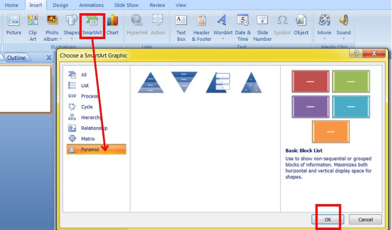
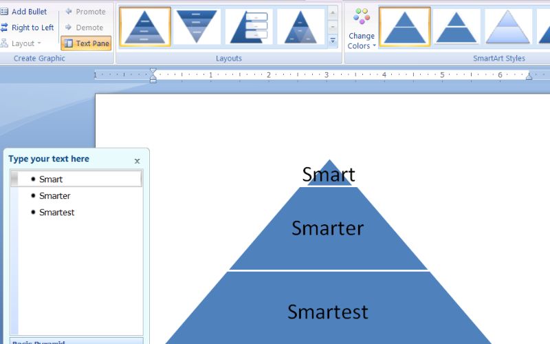
Sartu PowerPoint interfazearen Txertatu atalean eta hautatu SmartArt aukera.
Mugitu Piramide atalera Aukeratu SmartArt grafiko bat elkarrizketa-koadroa menuan. Aukeratu piramidearen diseinu hobetsia eta sakatu Txertatu botoia zure diapositiban jartzeko.
Kokatu testu-koadroen leku-markak piramidearen barruan eta idatzi zure datu-etiketak.
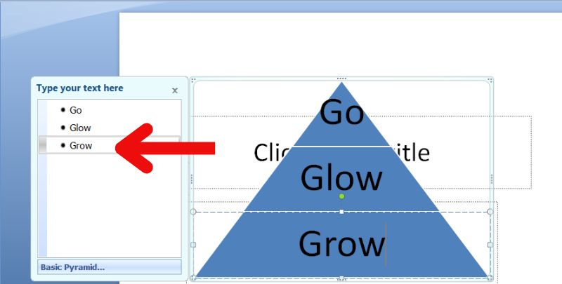
Piramidean eskuineko botoiarekin klik egin dezakezu eta hautatu Forma formatua. Honek itxura alda dezakezu koloreak, letra-tipoak eta ertzak aldatuz. Orain PowerPoint-a gorde dezakezu.
6. zatia. Egin piramide-diagrama Word-en
Prozesua Word-en SmartArt ezaugarriak erabiliz hasten da oinarri bat osatzeko. Microsoft Word-ek piramide-diagrametarako kutxako aukerarik ez badu ere, bat egin dezakezu bere marrazkia eta formak edo piramidea erabiliz. Ondoren, testu-koadroak erabiltzen dira piramidearen atal bakoitza izendatzeko. Hona hemen Word-en piramide-diagrama bat egiteko urratsak.
PROS
- Doan eta erraz eskura daiteke.
- Testuaren formak, koloreak eta estiloak aurreikusitako efektu bisuala lortzeko.
KONTRA
- Baliteke diagramak sortzeko software espezializatua erabiltzeak baino denbora gehiago behar izatea.
- Ez dago elementuen gainetik pasatzeko aukerarik datu-puntu zehatzak ikusteko, eta diagrama ezin da dinamikoki eguneratu.
Ireki zure Microsoft Word aplikazioa eta hasi dokumentu berri bat edo kargatu piramide-diagrama sartu nahi duzun bat.
Hautatu Txertatu aukera zure tresna-barraren goiko aldean, eta gero SmartArt. Microsoft PowerPoint-ekin berdin, gainerako urratsak jarraitu ditzakezu.
7. zatia. Piramide-diagrama nola sortu buruzko galderak
Zer da piramide-diagrama Excel-en?
Excel piramide-diagrama bat barra horizontalez osatutako triangelu baten itxura duen diagrama mota berezia da. Informazioa 100%-ra batzen duten ehunekotan bistaratzen du. Zati bakoitzaren tamainak daukan informazioaren garrantzia erlatiboa erakusten du.
Nola egiten dut grafiko bat Word edo Excel-en?
Idatzi zure informazioa Excel gelaxketan. Hautatu zure informazioa duten gelaxkak. Zoaz Txertatu atalera, aukeratu nahi duzun diagrama-estiloa (zutabea edo lerroa adibidez) eta sakatu Txertatu botoia. Erabili diagrama-tresnak (Diseinua, Diseinua, Formatu fitxak) zure diagramaren osagaiak doitzeko. Gorde Excel fitxategia zure diagrama eta datuak seguru mantentzeko. Excel-en, erabili Ctrl + C zure diagrama kopiatzeko. Mugitu Word-era, hautatu diagramarako nahi duzun kokapena eta kopiatu (Ktrl + V). Egin klik Word-eko diagrama estekatutako Excel datuetatik eguneratzeko. Gorde zure Word fitxategia zure diagrama eta edukia seguru daudela ziurtatzeko.
Zer esan nahi du piramideak PowerPoint-en?
PowerPoint-en, piramide bat hierarkia-mailak erakusten dituen diagrama bat da. Forma bat erabiltzen du bisualak hobetzeko eta antolaketa-informazioa erakusteko.
Ondorioa
Programa hauek aukera ematen dizute sortu piramide-diagrama. Gauza askotarako erabil ditzakezu, adibidez, datuak aztertzeko, diapositibak egiteko, talde-proiektuak lantzeko edo dokumentuak ilustratzeko. Aplikazio bakoitzak funtzio bereziak ditu. Datuak erakusteko eta bidaltzeko atal desberdinak kudeatzen dituzte. Horri esker, erabiltzaileek beren behar eta gustuetarako aukerarik onena aukeratzen dute.