Trin-for-trin guide til at lave et segmenteret søjlediagram
EN segmenteret søjlediagram er et diagram, der opdeler data i mindre dele inden for hver søjle for at sammenligne forskellige grupper eller kategorier og deres underkategorier. Hver del af bjælken repræsenterer en kategori, der viser dens procenter. Du kan bruge det på mange områder, som f.eks. erhvervs- og samfundsvidenskab, til at sammenligne og forstå data. For eksempel kan en virksomhed bruge det til at sammenligne salg efter produkt, region eller kundegruppe. Denne artikel viser dig, hvordan du laver letlæselige og iøjnefaldende søjlediagrammer opdelt i sektioner. Du lærer om at organisere data, vælge de rigtige billeder og gøre graferne nemme at forstå. Til sidst vil du være i stand til at repræsentere dine data og engagere dit publikum nøjagtigt.

- Del 1. Hvad er et segmenteret søjlediagram
- Del 2. Lav Segment Bar Graph med MindOnMap
- Del 3. Sådan laver du et segmenteret søjlediagram i Excel
- Del 4. Sådan laver du et segmenteret søjlediagram i Google Sheets
- Del 5. Ofte stillede spørgsmål om, hvordan man laver segmenteret søjlediagram
Del 1. Hvad er et segmenteret søjlediagram
Et opdelt søjlediagram, også kaldet et stablet søjlediagram, får data til at se pæne og klare ud ved at opdele forskellige datatyper i mindre dele inde i hver søjle. Et søjlediagram opdeles i sektioner, der repræsenterer forskellige underkategorier.
Sådan fungerer det:
Hver søjle er udpeget til en bestemt kategori eller gruppe og opdelt i segmenter. Hvert segment er en underkategori af bjælkens hovedkategori. Længden af hvert segment er proportional med den procentdel eller andel, det repræsenterer af den samlede søjle.
Nøglekarakteristika:
• Effektiv til at sammenligne flere kategorier eller grupper.
• Demonstrerer sammensætningen af hver gruppe.
• Visualiserer del-til-hel-forhold.
• Brug af forskellige farver, mønstre eller nuancer for hvert segment gør det nemt at skelne mellem de forskellige underkategorier og lette sammenligninger.
Del 2. Segmented Bar Graph Maker med MindOnMap
MindOnMap er et praktisk onlineværktøj til at lave tankekort og diagrammer, der er nemt at bruge og lader dig oprette forskellige slags visuelle datavisninger. Det tilbyder en platform til brainstorming, organisering af information og skabelse af visuelle hjælpemidler. MindOnMap er mest kendt for sin evne til at lave mindmaps. Det gør det også muligt for brugere at generere diagrammer, herunder segmenterede søjlediagrammer.
Sikker download
Sikker download
Bedst til
• Enkeltpersoner og små hold: MindOnMap er ideel til solo eller små grupper, der leder efter en brugervenlig platform til datavisualisering.
• Uddannelsesformål: Det er også fantastisk til akademiske omgivelser med et brugervenligt design, der hjælper med at lave visuelle hjælpemidler som grafer og diagrammer til præsentationer eller rapporter.
• Hurtige, enkle visualiseringer: MindOnMap kan hurtigt oprette grundlæggende grafer, som segmenterede søjlediagrammer. Det kræver lidt tilpasning.
PROS
- Nem at få fat i og afhente hurtigt, perfekt til nybegyndere.
- Du kan bruge det online uden installation, og det er tilgængeligt fra enhver enhed med internettet.
- Understøtter flere brugere, der arbejder sammen på et diagram.
- Tilbyder en række diagramtyper, herunder segmenterede søjlediagrammer.
ULEMPER
- Færre tilpasningsmuligheder sammenlignet med specialiserede værktøjer.
- Ydeevne kan blive påvirket af store datasæt.
- Gratis versioner kan have begrænsninger på funktioner eller eksportmuligheder.
Trin i at lave segmenterede søjlediagrammer i MindOnMap
Sådan laver du et segmenteret søjlediagram: Åbn din foretrukne browser og søg efter MindOnMap i søgelinjen. Start linket, klik på knappen Ny, og vælg funktionen Flowchart.
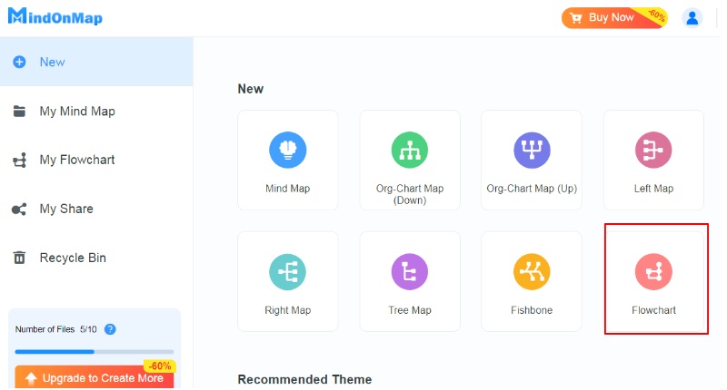
Vælg knappen Tekst under panelet Generelt i venstre side af skærmen. Indtast teksten af dine data manuelt.
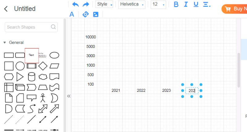
Derefter etablerer du de segmenterede bjælker ved hjælp af formen under rullemenuen Generelt. Tilpas størrelsen på rektanglet i henhold til dine data.
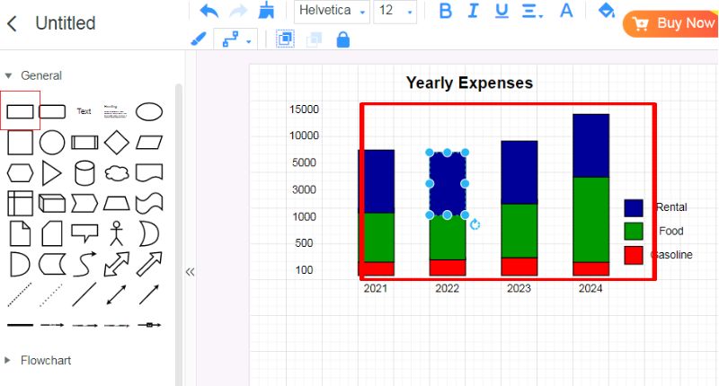
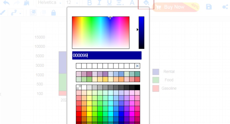
For at ændre dens farve skal du blot klikke på malerspanden for at tilpasse dine bjælkefarver. Derefter kan du gemme og dele dit arbejde med dit team.
Del 3. Sådan laver du et segmenteret søjlediagram i Excel
Microsoft Excel er et kraftfuldt regnearksværktøj. Det kan analysere, organisere og visualisere data. Den har et gitter af rækker og kolonner. Det hjælper med input, beregninger og datamanipulation. Excels mange funktioner, formler og diagrammer gør det til et must-have værktøj. Du kan bruge det i virksomheder, enkeltpersoner og organisationer i alle brancher.
Bedst til
• Excel er fantastisk til at arbejde med big data og lave kompleks matematik.
• Den har stærke funktioner til rengøring, sortering og ændring af data.
• Du kan personliggøre diagrammer og tabeller meget.
• Det fungerer godt med andre Microsoft Office-apps som Word, PowerPoint og Outlook.
PROS
- Avancerede dataanalysefunktioner.
- Fleksibilitet i design af visualiseringer og rapporter.
- Populær blandt millioner globalt, kendt af mange.
- Fungerer godt sammen med andre Microsoft Office-værktøjer.
ULEMPER
- Avancerede funktioner kræver tid og kræfter.
- Behov for en Microsoft Office-licens.
- Risiko for fejl fra forkerte formler eller data.
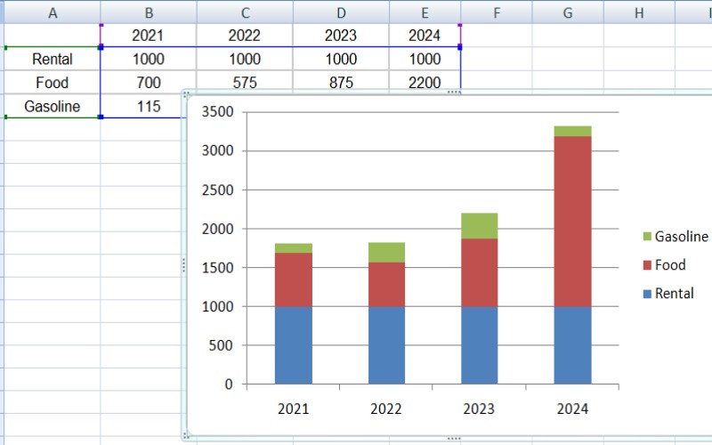
Organiser dine data i en tabel med kategorier i én kolonne og deres værdier i den næste, så du tydeligt mærker alt for bedre forståelse. Vælg det datasæt, du vil bruge i din graf, inklusive kategorinavne og deres værdier.
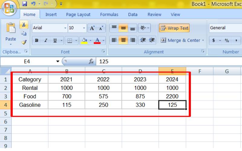
Gå til fanen Indsæt i Excel, og klik derefter på Diagrammer på båndet. Vælg Kolonne fra rullemenuen Diagrammer, og vælg Stablet kolonne for et grundlæggende segmenteret søjlediagram.
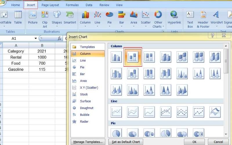
Navngiv dit diagram, tilføj etiketter til x-aksen og y-aksen for klarhed, og medtag dataetiketter for at fremhæve specifikke værdier. Skift farverne på segmenterne for bedre visuel appel, og juster layoutet for at gøre diagrammet lettere at læse.
Del 4. Sådan laver du et segmenteret søjlediagram i Google Sheets
Google Sheets er en skybaseret regnearksapp. Det lader brugere oprette, redigere og samarbejde online. Det er et af Googles produktivitetsværktøjer. Den har en brugervenlig grænseflade og kraftfulde dataorganiserings-, analyse- og visualiseringsfunktioner. Dets samarbejdsfunktioner i realtid, tilgængelighed fra enhver enhed med internetforbindelse og integration med andre Google-tjenester har gjort det til et foretrukket valg for enkeltpersoner, studerende og virksomheder. Selvom det ligner traditionel regnearkssoftware som Microsoft Excel, tilbyder Google Sheets flere unikke fordele, herunder dens gratis basisversion og problemfri integration med andre Google Workspace-værktøjer.
Bedst til
• Google Sheets er fantastisk til samarbejde i realtid, og lader mange mennesker redigere et regneark samtidigt.
• Du kan få adgang til den fra enhver enhed, der er online.
• Det er nemt at dele med andre og give dem adgang til forskellige regnearksdele.
• Der er også en gratis basisversion, der har de nødvendige grundlæggende funktioner.
PROS
- Kan arbejde sammen i realtid.
- Ingen softwareinstallation er nødvendig; bare adgang fra enhver enhed.
- Den grundlæggende version er gratis.
- Nem at forbinde med Google Drev-apps.
ULEMPER
- Har brug for internet til offline arbejde.
- Færre avancerede funktioner end Excel, især til specialiserede opgaver.
- Det kan være langsommere med big data.
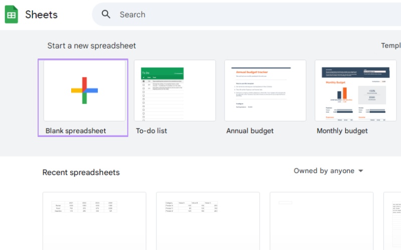
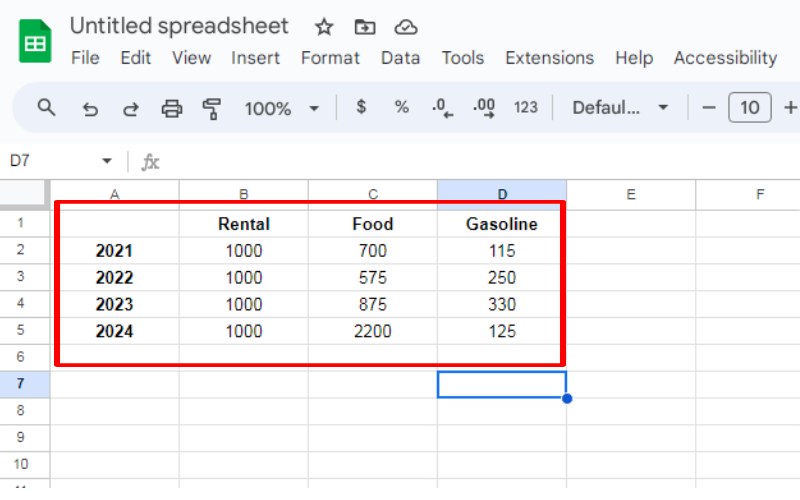
Opret et nyt ark for at indtaste data. Sørg for, at dine data er sorteret pænt i en tabel med kategorier i én kolonne og deres oplysninger i den næste, og mærk tydeligt hver kolonne.
Opret et segmenteret søjlediagram ved at vælge alt, hvad du ønsker i din graf, inklusive kategoriernes navne og data.
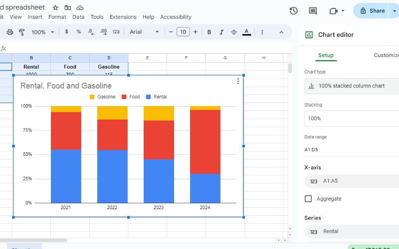
Find knappen Indsæt på Google Sheets-værktøjslinjen, og klik derefter på Diagram i rullemenuen. Et diagram, der passer til dine data, vises. Vælg et kolonnediagram og rediger det ved at klikke på diagrammet til højre for ændringer. Du kan redigere det til et stablet søjlediagram.
Del 5. Ofte stillede spørgsmål om, hvordan man laver segmenteret søjlediagram
Hvordan laver man et segmenteret søjlediagram i Google Docs?
Desværre kan du ikke direkte oprette et segmenteret søjlediagram i Google Docs. Google Docs er primært et tekstbehandlingsprogram og har ikke indbyggede muligheder for at oprette diagrammer. Du kan dog oprette en segmenteret søjlediagram ved at bruge Google Sheets og indlejre det resulterende diagram i dit Google-dokument. Opret et nyt Google Sheet. Indtast dine data i et klart format. Indsæt et diagram, vælg den segmenterede søjlediagramtype. Tilpas diagrammet efter behov. Kopiér og indsæt diagrammet som et billede i dit Google-dokument.
Hvordan tilpasser du en graf på Google Docs?
Selvom Google Docs ikke har omfattende graftilpasningsmuligheder, kan du anvende grundlæggende formateringsændringer på et diagram, der er indlejret fra Google Sheets: Tilpas størrelse: Juster diagrammets størrelse, så det passer til dit dokument. Tilføj en titel: Angiv en klar og beskrivende titel til diagrammet. Skift skrifttype: Rediger diagramelementernes skrifttypestil, størrelse og farve. Tilføj etiketter: Inkluder akselabels og dataetiketter for overskuelighed. Juster farver: Skift diagrammets farveskema, så det passer til dit dokuments tema. Bemærk, at for mere avanceret tilpasning skal du foretage ændringer direkte i Google Sheets, før du indlejrer diagrammet.
Hvordan laver man et simpelt søjlediagram?
Bruger fremragende søjlegraffremstillere ligesom Google Docs er det ligetil at oprette et simpelt søjlediagram. Følg disse trin: Indsæt et diagram i dit dokument. Vælg søjlediagramtypen blandt de tilgængelige muligheder. Indtast dine data i diagrameditoren. Tilpas diagrammet med titler, etiketter og farver efter behov. Husk, at et grundlæggende søjlediagram viser data med søjler, og størrelsen af hver søjle viser, hvor meget noget i en bestemt kategori er værd. Det er nyttigt til at sammenligne værdier på tværs af forskellige kategorier.
Konklusion
Segmenterede søjlediagrammer er gode til at vise komplekse data. De opdeler data i dele inden for hver søjle for at sammenligne, vise og spotte tendenser. Denne guide dækker alt om dem, som hvad de er, hvordan man bruger dem, og hvordan man laver dem med forskellige værktøjer. Du kan bruge MindOnMap til nem brug, Excel til dets avancerede værktøjer eller Google Sheets til at arbejde med andre. Nu ved du, hvordan du laver klare og attraktive segmenterede søjlediagrammer. Sørg for, at dine data er klar, vælg de rigtige kategorier og dele, og juster din graf for at dele dine resultater godt. At lære denne færdighed kan forbedre, hvordan du fortæller historier med data og træffer beslutninger.