What is Power Bi Funnel Chart and How to Create It
Today, we will explore the intriguing realm of the Power BI Funnel Chart. We all know that these charts are quite helpful for visualizing intricate procedures like project management and sales pipelines. In addition, as we discuss the different facets of funnel charts, keep in mind that the description provides easy access to all pertinent sources and references. Come along as we reveal the transformational potential of funnel charts for data visualization and analysis.

- Part 1. What is Power BI?
- Part 2. What is a Funnel Chart in Power BI?
- Part 3. When to Use a Funnel Chart in Power BI?
- Part 4. How to Create a Funnel Chart in Power BI?
- Part 5. Easier Way to Make Funnel Chart
- Part 6. FAQs about Power BI Funnel Chart
Part 1. What is Power BI?
Let's start by defining a funnel chart and discussing its use. A funnel chart is a specific tool for monitoring a process’s stages. Every segment of the funnel symbolizes a distinct phase. These phases can, for example, involve prospect creation, negotiation, documentation, and transaction completion in a sales scenario. The funnel makes it evident how many opportunities move through each phase by graphically representing the quantity or value at each stage.
Part 2. What is a Funnel Chart in Power BI?
Power BI is a potent analytics and data visualization tool that extracts data from many sources. It may assist you in rapidly understanding your data. On the other hand, a funnel chart is a particular kind of chart used to show how data flows through a system or process. It is simple to read and comprehend and illustrates how data moves through a process at every level. It depicts a linear process with connected and sequential steps.
A funnel chart displays data flow visually, with a wide head and a narrow neck at the bottom. It is commonly utilized to illustrate many stages of an extended process, such as the sales funnel, recruitment process, and item order fulfillment process.
Part 3. When to Use a Funnel Chart in Power BI?
Funnel charts are especially helpful in locating process bottlenecks. A considerably constricted portion of the funnel, for instance, can point to a stage where prospective purchases are frequently missed. With this visual hint, managers and teams can more effectively target their improvement efforts. With all of that, here are the same takeaways we need to remember when we use a Funnel Chart in Power BI.
• To monitor a workflow process, usually using declining values.
• Determine the data's potential when it follows a sequential path.
• When the first stage's item count exceeds that of the subsequent stage, and so forth.
• To monitor a process's progress, success, and bottlenecks in order to make improvements.
• To determine various processes' conversion and retention rates.
• To assess the effectiveness or development of any methodical procedure.
Part 4. How to Create a Funnel Chart in Power BI?
We are now proceeding with the steps needed to create a Funnel chart easily. In this portion, we will learn how to use Power BI to create a Funnel Chart. Please remember that a Power BI Funnel Chart is very effective and helpful for people who work in Marketing and Sales agencies. Kindly see the steps below and follow them properly.
Steps in Creating Funnel Chart using Power BI
The first thing we need to do is choose the Funnel Chart option while Power BI is open. This option will help a lot if you are working with a dataset that divides sales information into product subcategories.
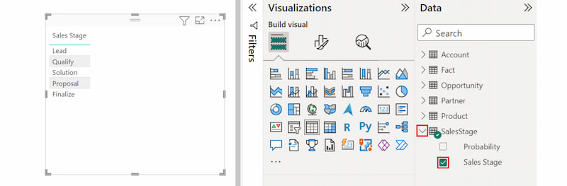
Now, to fill the chart, select the Group dimension, such as a product subcategory, and the Value metric, such as sales or profit.
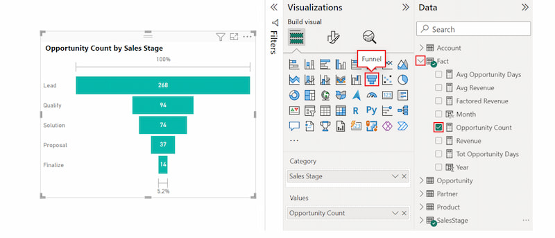
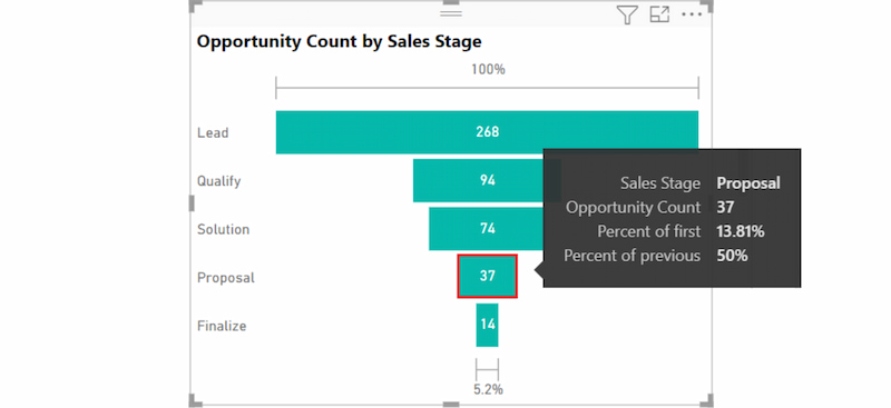
At this portion, we need to know that Power BI offers a great deal of customisation. The chart can be formatted in various ways, and tooltips, such as Profit Information, are added. You can apply conditional formatting based on various parameters and change the color schemes.
Finally, please ensure that you know correct data interpretation is the key to using funnel charts efficiently. Seek for trends, such as a notable decline in one stage or an exceptionally strong showing in another.
Tips for Making a Funnel Chart using Power BI
• Use conditional formatting to draw attention to specific elements in a different color.
• For effective communication, always keep them enabled.
• Conversion Ratios can provide information on how effective each step is.
• You can experiment with titles, backgrounds, and other formatting elements to enhance your chart’s visual appeal and information.
Part 5. Easier Way to Make Funnel Chart
MindOnMap
We can see that Power BI is a bit technical when it comes to creating a flow chart and Funnel Chart. With that, we are sure that you are in need of more of an alternative to make a funnel chart much easier. For that, you do not need to worry because we will introduce you to MindOnMap, a tool that offers great features and an easier process of creating your Funnel Chart. With that, let us get to know more about MinOnMap with this overview.
A user-friendly cloud-based program called MindOnMap is mainly intended for mind maps, flowcharts, and other types of diagrams. That is also the main reason why it is the best alternative for Power BI. More than that, it is flexible and easy to use for arranging ideas and visual planning, much easier than Power BI. With this tool, it would be possible to make a simple funnel diagram with great customization. Take a look at the steps we need to take in order to use MindOnMap to have a funnel chart with ease.
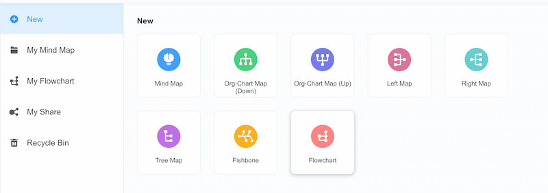
On your computer, please install the MinOnMap software and access the icon for New. From there, click the Flowchart feature.
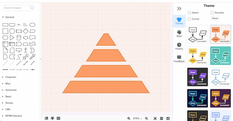
After doing that, let’s proceed with adding the Shapes you need to build your Funnel Chart. You can use the shape on the left side.
Now, we need to label the shape based on the data we want to present. To do this, click the shape and type using your keyboard.
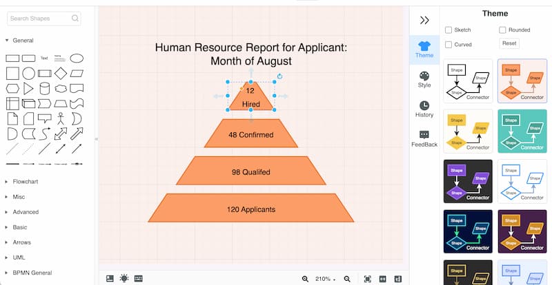
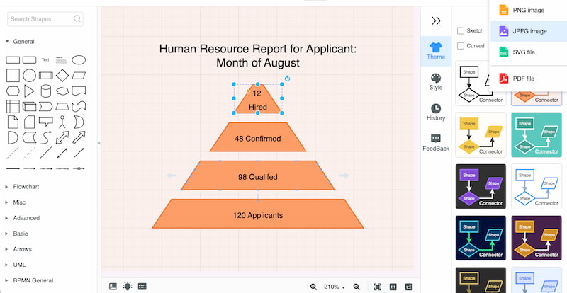
After that, we need to ensure that the details are correct. Therefore, double-checking and proofreading the chart is a must. You can save your chart by clicking the Save button and choosing the format you prefer.
Indeed, using MindOnMap as a tool to create a funnel chart is easier than using other complicated tools. The steps are simple yet can give us a high-quality result. With that, even new users can enjoy creating reports for their presentations or clients’ reports.
Part 6. FAQs about the Power BI Funnel Chart
What are funnel charts used for?
Funnel charts are useful tools for visualizing data reduction in successive stages, such as client acquisition or sales pipelines. They help pinpoint the locations of bottlenecks and drop-offs.
What is the funnel function in Power BI?
Power BI's funnel chart illustrates data in the form of a funnel, illustrating how values drop as a process progresses, much like a sales funnel. It's helpful for monitoring conversion rates and figuring out user dropout points.
Is Power BI the same as Excel?
No, Excel and Power BI are not the same thing. Excel is a spreadsheet tool for data manipulation and calculations, whereas Power BI concentrates on advanced data visualization, real-time analysis, and dashboard sharing. The two instruments work well together.
What distinguishes a Power BI waterfall chart from a funnel chart?
Funnel chart versus waterfall chart. While funnel charts illustrate the movement of data through many stages of a process or conversion, highlighting conversion rates or success rates at each stage, waterfall charts concentrate on illustrating changes in values over time or stages.
What is the best between Power BI vs Google Sheets to create a funnel chart?
Creating funnel charts on Google Sheets is possible, like in Power BI. Many users are using Google sheets because it is famous and can offer great features. Therefore, depending on your status, your professional choice is Google Sheets, while Power BI is suitable for casual processes.
Conclusion
In Power BI, funnel charts are an effective tool for evaluating and visualizing process flow, especially in project and sales management. By knowing the influence of each stage, businesses may optimize their processes for greater efficiency and outcomes. Try out these charts in your own Power BI applications to get insightful information. Yet if you think that Power BI does not give you the satisfaction you need, then MindOnMap is a tool you can use without regret. This tool offers a much simpler and high-quality output for your charts. You can use it now and see everything it offers.