The Ultimate Guide to Infographics Example and Template Designs
Tape infographics are a cool way to show off information in a way that's easy to understand, interesting, and sticks in people's minds using tape-shaped graphics to display data, these infographics offer a fresh and eye-catching method for sharing stories, breaking down complicated ideas, and showing off numbers. In this detailed review, we will deeply dive into the infographic examples and templates, covering everything from why they're useful and what they can do for you to how to make your own. We'll look at popular templates, check out real-life examples, and give you a step-by-step tutorial on how to whip up your tape infographics with MindOnMap.It will give you everything you need to make awesome, impactful tape infographics. So, let's jump right in and see how tape infographics can grab and hold your audience's attention.

- Part 1. What is Tape Infographics
- Part 2. 8 Common Template
- Part 3. 7 Common Example
- Part 4. Best Infographic maker MindOnMap
- Part 5. FAQs about Infographic Example and Template
Part 1. What is Tape Infographics
Tape infographics are a cool and creative way to show information using tape-like graphics or shapes. They look like strips of tape and can be used to split up information or point out important details. The tape design makes them look good and is great for keeping things organized in a straight line.
Using Tape Infographics
Infographics are a popular way to present information in talks, reports, and learning. They're great for making complex info easier to understand by splitting it up into bite-sized pieces. They're perfect for step-by-step timelines, side-by-side comparisons, or any data that works well in a clear, organized way. The tape shape makes it easy for the person looking at the infographic to follow along in a sensible order.
Advantages of Tape Infographics
•The tape design makes them look cool and creative, making the info more fun to look at and easier to remember.
•It makes it simple to sort out the info, making it easier for people to get what's happening with complicated data.
•They're great for all sorts of stuff, like timelines, understanding how things work, and comparing things, so they're pretty handy for different kinds of content.
•The straight-up line format of tape infographics makes it easy to get the point across without any confusion, making you less likely to get it wrong.
Part 2. 8 Common Template
An infographic template is a pre-made design. It makes creating eye-catching, useful infographics easier. These templates are for various purposes, like showing data, breaking down ideas, or sharing a story. They cut down on the work and time by giving you a set-up that you can tweak to match your content and style. Here’s the
1. Timeline Infographic
Timelines are examples of infographics showing events or big moments in order over time. It's a great way to present historical facts, project schedules, or any other information in the right order so that it is easy to understand.
Pros: Great for displaying how events unfold over time. It makes sorting out data in order easy.
Use: Usually used in history talks, project schedules, and company big moments.
2. Comparison Infographic
A Comparison infographic template shows two or more things next to each other, helping us see what they have in common and what's different. This layout is perfect for a clear, neat exam of products, services, ideas, or concepts.
Pros: It is easy to see how different products, ideas, or concepts compare.
Use: This is great for showing off what makes a product special in marketing or for comparing theories or data in school.
3. Statistical Infographic
A Statistical infographic template is designed to showcase numbers and data in a way that's both eye-catching and easy to understand. It simplifies tricky stats into simple pictures, making it a great choice for reports, surveys, or presentations that rely on data.

Pros: It shows complicated data in a way that's easy to understand, making numbers and stats easier to understand.
Use: Often used in reports, surveys, and presentations where you must show off the data.
4. Process Infographic
A Process infographic template shows a process that breaks down several steps or actions in a specific process. It's great for workflows or doing something step-by-step, making it easy for people to understand and follow along.
Pros: Break down a process into clear, easy-to-follow steps, making it great for instructional content.
Use: Frequently used in how-to guides, manuals, and workflow explanations.
5. Informational Infographic
Informational infographic templates about making complicated stuff easy to understand by breaking it down into a simple, picture-based format. It's super popular for teaching people about certain subjects, giving them clear and easy-to-get info.
Pros: Great for quickly getting the point across.
Use: Perfect for school stuff, explaining rules, or telling people about something in detail.
6. Geographic Infographic
A Geographic infographic usually uses maps to show data with a location or map theme. It's great for showing stats about a region, people's info, or data related to where things are.
Pros: Shows data using maps and stats from different areas.
Use: Mainly used in talks about area-specific info, like population studies or marketing data.
7. List Infographic
A List infographic template is a simple layout that puts info in a list. It's great for showing off important details, top lists, or checklists in a way that's easy for people to look over and get quickly.
list-infographic-template.jpgPros: Arrange information in a list, making it easy to review and get the gist quickly.
Use: Perfect for lists, top 10 lists, or highlighting the main ideas in an article.
8. Hierarchical Infographic
A Hierarchical infographic template shows how important things are or who's related to who in a setup, like company charts or family trees. It makes it easy to see who's on top or below in a group.
Pros: It makes it easy to see how different parts or groups connect the system.
Use: You'll find it in company charts, family trees, and lists of categories.
These popular, free infographic templates have cool features. They let you present information neatly and attractively. Deciding which one to pick depends on what you're talking about and trying to say. Whether you're breaking down a process, showing off different choices, or sharing numbers, these templates give you a handy and quick way to make eye-catching infographics.
Part 3. 7 Common Example
Infographics are handy tools that show data, ideas, and info in a cool, visual way. They mix pictures, words, and numbers to explain complicated stuff in a snap and in a way that's easy to get. Infographics make everything more interesting and easier to get to. Here are seven typical infographic examples for students, teachers, business people, etc., regarding their jobs in different situations.
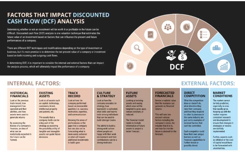
1. Data-Driven Infographic
Data-driven infographics examples show off numbers and facts using cool visuals like charts, graphs, and diagrams. These make tricky data easier to get and understand by turning those numbers into eye-catching stuff. Data-driven infographics are super good at sharing what you find out from research, surveys, looking at numbers, and other stuff that's all about data. They make it easy for people to see the big picture, like trends, patterns, and how things are connected, which makes them super useful for reports, presentations, and telling stories with data.
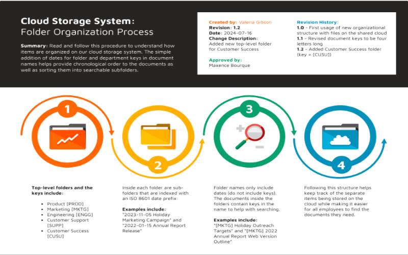
2. Process Infographics
A Process is the best infographic examples showing how to do something step by step in a way that's easy to get. It simplifies tricky tasks into simple steps, making it easier for people to figure out how to do something or get a result. It uses pictures, arrows, and flowcharts to make the instructions more interesting and easy to understand, whether you're learning, getting trained, or just need help with a process. They're great for showing how things work, how to do a tutorial, assemble a product, or any other task that needs steps.
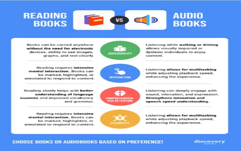
3. Comparison Infographics
A comparison infographic examples that let you side-by-side compare two or more things, ideas, or choices to see what they have in common and what sets them apart. It's perfect for making smart choices by showing you the good and bad points, features, and what each thing is all about. Whether you're looking at products, services, thoughts, or data sets, a comparison infographic makes complicated stuff easier to understand, helping people quickly see the main differences. By putting info in an organized and eye-catching way, comparison infographics are a go-to in marketing, learning, and making decisions.
4. Statistical Infographics
Statistical infographic examples show numbers in a way that's easy to understand and grabs your attention. It turns boring numbers into eye-catching stuff like charts, graphs, and other visual displays, making it simpler for people to quickly get the hang of complicated info. These infographics are handy for breaking down research findings, survey results, or any info packed with numbers, all about getting the main points across clearly. Whether using them in reports, marketing, or school materials, statistical infographics make data come alive, making it more relatable and easier to get.
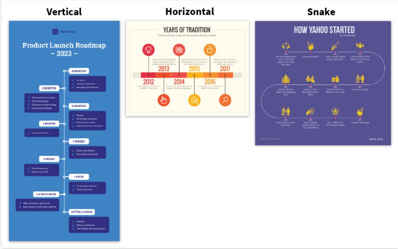
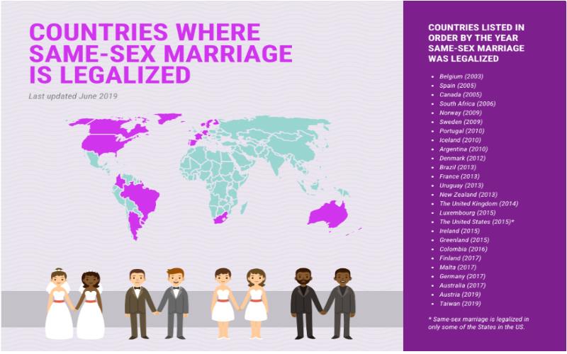
5. Timeline Infographics
Timeline infographic examples are events, big moments, or tasks over a certain time. It helps people see how things happen in order, making it simpler to see how many actions or events occur over time. Timelines are great for showing how things have changed over history, how a project is going, or any other process about steps or events using pictures, symbols, and dates. Timelines make it easy and fun to follow along and show how things or milestones have changed, giving us a good look at what happened and why.
6. Educational Infographics
An educational infographic examples that make complicated info easy to get and understand. It mixes words, pictures, and numbers to make learning fun and straightforward. You'll find them in schools, training, and learning to make things clearer, show how things work, and present info in a way that catches your eye. Educational infographics break complex subjects into small, clear bits. They help students remember key points.
7. Marketing Infographics
A marketing infographic examples that show off marketing info, plans, and smart ideas in a way that grabs your attention and makes it easy to get. It's made to catch your eye and quickly get the main points across, often using charts, graphs, and symbols to show how well things are doing, what's happening in the market, or how a campaign turned out. You'll find them in ads, social media, and business reports to make sure people notice the brand, get involved, and help push marketing forward. By making data and ideas look good, marketing infographics help companies share what they're all about and make it easier to make decisions.
Part 4. Best Infographic maker MindOnMap
MindOnMap is a cool tool for making infographics that look good and are shareable. It's easy to use and lets you tweak everything to your liking, making it perfect for novices and pros who want to create eye-catching infographics. You can turn tricky data and ideas into simple, eye-catching visuals, ideal for sharing in presentations, reports, and school stuff.
Secure Download
Secure Download
Here’s how to do it:
Click the link provided, log in first, and keep going. If not, head over to MindOnMap and sign up for an account.
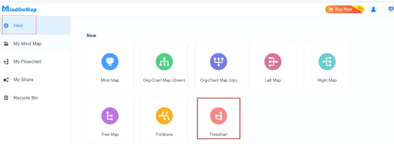
Click the New button and select Flowchart for Infographic.
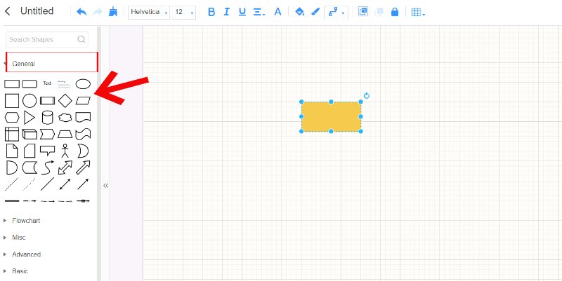
Play around with MindOnMap's editing tools. Start by choosing a shape using the General option. Explore the Flowchart and switch up the colors, fonts, and layout.
Start adding your info, charts, graphs, icons, and text boxes. By organizing everything right, make sure your infographic looks good and is easy to read. Play around with sizes and alignments to make it look professional.
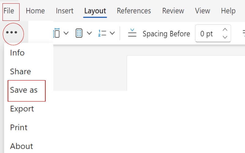
Save your work. You can now share your presentations and reports online.
MindOnMap's easy-to-use design and powerful features make it the best choice for creating top-notch infographics that communicate your message effectively and grab your audience's attention.
Part 5. FAQs about Infographic Example and Template
Is there an infographic template in Word?
Yes, Microsoft Word has some cool infographic templates you can use to create charts and pictures that showcase data and information. These templates make it fast and simple to whip up infographics without having to be a pro at graphic design software.
Is there an infographic template in PowerPoint?
Yes, PowerPoint has some cool infographic templates. They can make your presentations and infographics look great. These templates simplify showing off data and ideas in a way that's easy to understand and share.
What are the five elements of the infographic?
Infographics have five main parts that help share information clearly and interestingly. Here they are Title: This short and catchy title quickly tells you what the infographic is about. Visuals: These include pictures, symbols, charts, and drawings that help explain the information. Data: This is the information the infographic is trying to share, which can be numbers, facts, or descriptions. Text: This part explains, describes, and adds more details to what the visuals show. Layout: This is how the infographic is put together, including text, visuals, and data.
Conclusion
Getting the hang of different kinds of infographic template and examples and how to use tools like MindOnMap gives you the know-how to share data and ideas in a cool visual way.