Steps to Create Pyramid Charts on Different Tools
Have you ever needed to present complex data in an understandable and visually appealing way? This helpful guide will give you the skills and instructions to create a pyramid chart on different platforms. We'll start by looking at MindOnMap, an excellent tool for brainstorming. Seeing your information with MindOnMap builds a solid base. It makes effective pyramid charts. Next, we'll dive into the process of making pyramid charts on Microsoft Excel, Microsoft Word, Google Sheets, Google Docs, and Microsoft PowerPoint. By the end of this guide, you'll be an expert in making pyramid charts. They show your hierarchical data well on many platforms. Get ready to turn your data into clear and engaging visuals!

- Part 1. Create A Pyramid Chart with MindOnMap
- Part 2. Make A Pyramid Chart in Excel
- Part 3. How to Make a Pyramid Chart in Google Docs
- Part 4. Make A Pyramid Chart in Google Sheets
- Part 5. How to Make a Pyramid Chart in PowerPoint
- Part 6. Make A Pyramid Chart in Word
- Part 7. FAQs on How to Create Pyramid Chart
Part 1. Create A Pyramid Chart with MindOnMap
Although MindOnMap can't make charts alone, it is a good first step for making pyramid charts. You can use it with many other tools. Learning how to create a pyramid diagram on MindOnMap can become your hidden ace. MindOnMap is a software designed for mind mapping that enables you to visually think through and arrange data. It features a main subject from which subtopics and specifics are derived, thus forming a visual depiction of your data structure.
Secure Download
Secure Download
Main Features
• It helps you see the big picture and organize your data hierarchy before creating the chart.
• It promotes a clear and well-organized pyramid structure by visually laying everything out.
• It fosters brainstorming and exploration of data points and their placement within the hierarchy.
• Main theme & division
• Attractive Visual Components (hues, symbols, pictures)
• Organizational Structure Not Sequential
PROS
- It enables you to grasp the overall perspective and spot any missing elements.
- It facilitates the creation of a clear and orderly pyramid chart.
- It encourages creative thinking. It also urges examining many data points and their positions in the hierarchy.
- It is designed for easy collaboration. It lets team members work together on brainstorming and structuring the pyramid.
CONS
- It does not make direct chart creation.
- Its visual customization options are less extensive than those in specialized charting software.
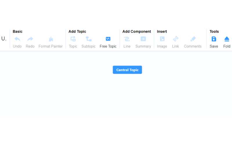
Start a new project by opening MindOnMap and selecting the Create Your Mind Map or Create Online option. Base Topic: In the core section, input the primary idea or theme you're considering for your mind map. It will serve as the cornerstone of your creation.

Go to the dashboard by selecting the +New, where various layouts are displayed. You can choose the Organizational Chart Map (Down) or the Organizational Chart Map (Up). Upon making your choice, you'll access the primary editing panel.

Select the organizational chart (down) to see the outline. You can select your preferred theme and receive the identical design in the Suggested Theme. Then, you can modify the content and layout to your liking.
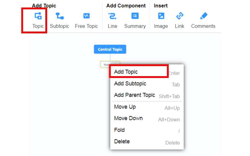
Right-click your mouse and select Add Topic from the pop-up menu. Alternatively, you can click on Topic at the top of the toolbar.
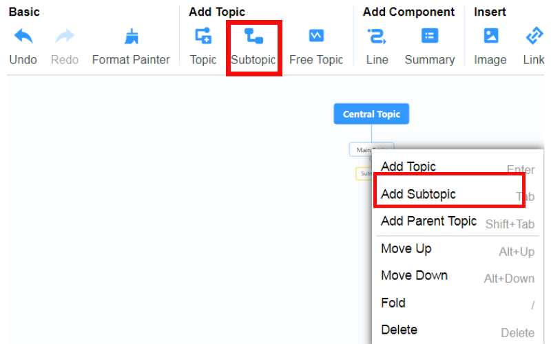
To include additional subtopics, simply adhere to the steps detailed in the related topic section. Right-click and choose Add Subtopic. Alternatively, select Subtopic from the top toolbar.
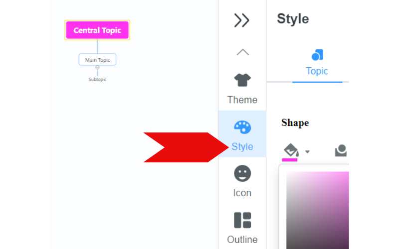
You can customize your chart's line, summary, images, link, comment, and icon and change its style. After editing, you can click Share in the top-right corner. Check the box for Passwords, and you can change it yourself. Then click Copy Link and Password and share the link with others.
Part 2. Make A Pyramid Chart in Excel
Are you looking to whip up a pyramid chart in Excel with minimal effort? SmartArt graphics is a built-in tool. It offers an easy way to make eye-catching pyramid charts. You can make them without dealing with complicated formatting. SmartArt is your top choice if you rush to create a pyramid chart for presentations or reports. It provides an easy way to make visually appealing pyramid charts. Here are the steps on how to make a pyramid chart in Excel.
PROS
- Pyramid charts adeptly display a hierarchical data structure in a visually captivating manner.
- It provides the option to craft various types of pyramid charts based on the nature and requirements of your data.
- It allows for more control over the chart's look. This includes the choice of colors, typography, and the style of showing data points.
CONS
- The extensive customization options that the stacked column chart method offers are needed.
Go to the spreadsheet where you want your pyramid graph to appear. Click the Insert option at the top of the Excel toolbar. Locate the Illustrations area and select the SmartArt option.
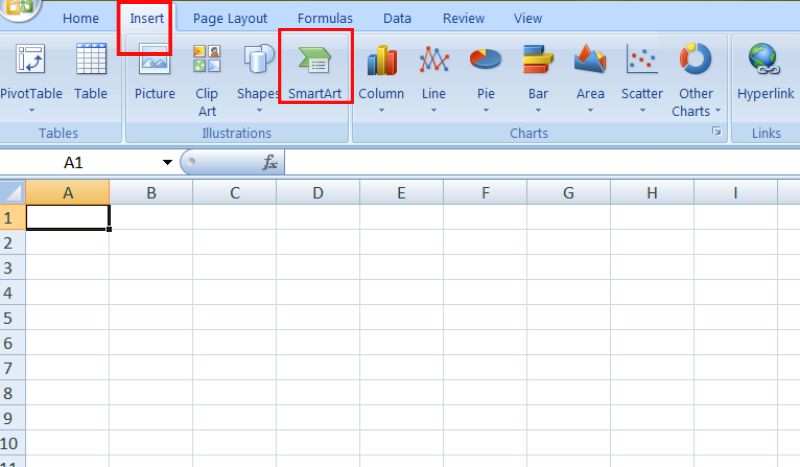
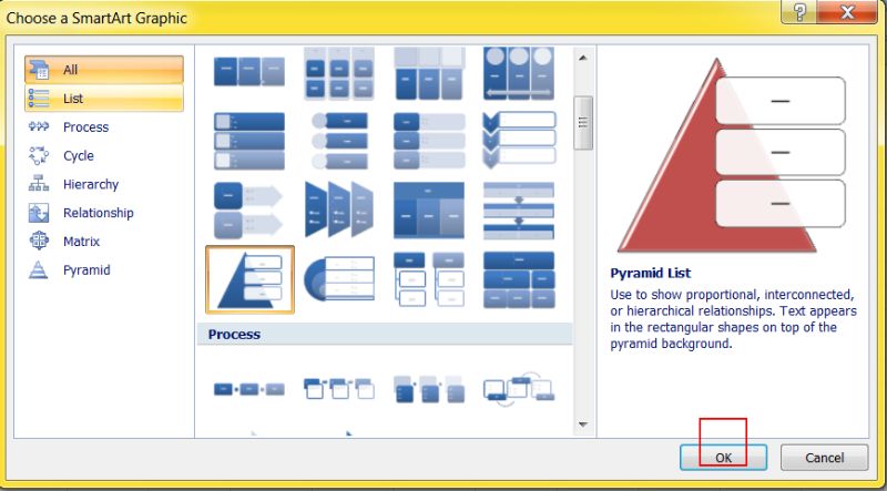
In the left section, select the Pyramid choice.Explore the various pyramid designs on display, all with distinct appearances. Select the model that suits your requirements.
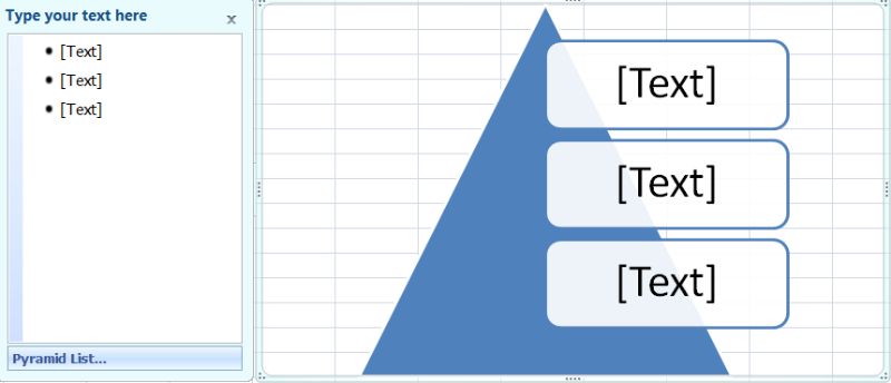
The chosen pyramid layout will appear in your spreadsheet.Every section of the pyramid will feature text. Put the data labels for each dummy box by selecting them with your mouse.
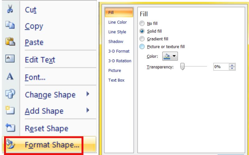
Right-clicking on the pyramid will lead to the selection of Format Shape. It will trigger a new Format Shape window to the right of your Excel window. Explore the Fill and Line tabs to alter the chart's colors and border styles. Also, you can change the size, shape, and color of the text on the pyramid chart. Do this by using the formatting options in the Excel ribbon.
If you're satisfied with the appearance of your pyramid diagram, you can adjust its dimensions and location by moving the four corners. You may also give the diagram a title by clicking within the pyramid and typing in your title.
Part 3. How to Make a Pyramid Chart in Google Docs
Although Google Docs lacks a specific tool for making pyramid charts, there's no need to worry! Thanks to creative problem-solving and Google Docs drawing, you can still make pyramid charts. This approach leverages the adaptability of Google Docs' drawing features. To create the pyramid form, you'll use lines and triangles and then incorporate text boxes to designate each level of the structure. Here is how to make a pyramid chart in Google Docs.
PROS
- It is easily accessible without any fees, which adds to its appeal.
- You have total freedom in shaping the pyramid, changing its hue, and tweaking the text style.
CONS
- It might take longer to craft a visually attractive pyramid graph through this approach.
- Do not provide the level of interactivity that charts in different platforms.
Go to your Google Drive and either start a new Google Doc or load an existing one to which you plan to add the pyramid chart.
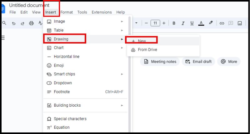
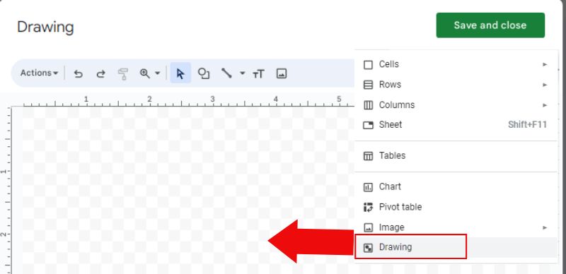
Select the Insert choice at the top of the list, choose Drawing, and add +New. It will open a window specifically for creating drawings.
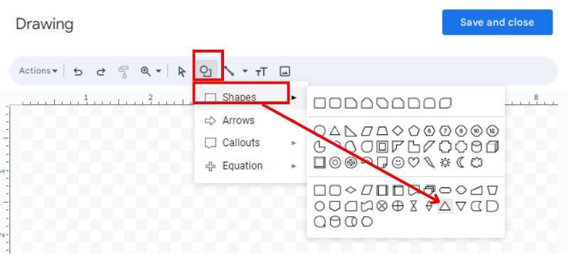
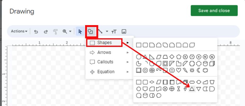
Find the shapes, then choose the triangle chart to draw automatically. Play around with colors.
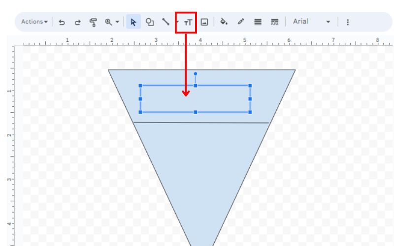
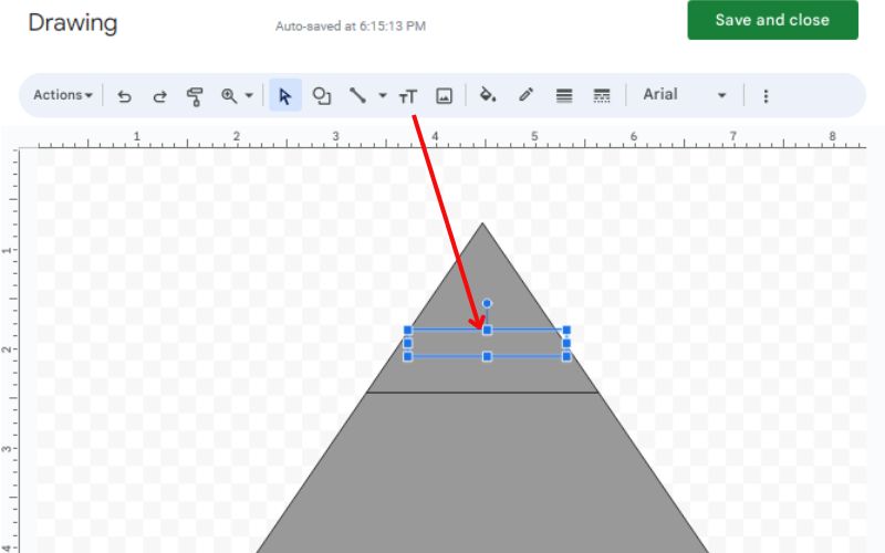
Select the Text Box feature and move it into the drawing space to form a text box. Inside the text box, write the label for the corresponding pyramid layer. Do this for each level in your pyramid structure.
Step 5. Adjust the dimensions, position, and color of the text boxes and pyramid shapes using the drawing tools
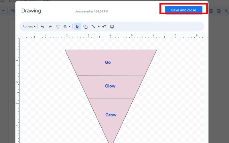
Step 6. After you're happy with your pyramid chart, click Save and Close in the drawing tool to set your modifications.
Part 4. Make A Pyramid Chart in Google Sheets
Google Sheets can help you make org chart, fuel chart, bar chart, etc. Although Google Sheets lacks a direct functionality for creating pyramid charts, an innovative method utilizes stacked bar charts. This method requires forming a stacked bar chart and then modifying it to look like a pyramid. It carefully arranges the data and tweaking the size of the bars. You can also use the drawing tools like Google Docs. This approach includes making a graphical element in your Google Sheet and altering it to mimic a pyramid form. Additionally, you can improve it by incorporating text containers for labeling information. Here is how to make a pyramid chart in Google Sheets.
PROS
- You can customize the look of your chart by choosing colors, fonts, and how data points are displayed.
- Charts are more interactive than pyramid charts made in Google Docs.
CONS
- Achieving the perfect pyramid shape could mean tweaking the data and the width of the bars.
In this case, I would use the drawing tool.
Go to the cell where you want to place your pyramid chart. Select Insert and click Drawing. An additional drawing window will appear.
Draw several triangles of different sizes, layering them to shape the pyramid. You can modify the appearance of the triangles (color, line width) for a personal touch.
Activate the Text Box function and position it at the desired place on your pyramid. Enter the hierarchy data label for that specific tier. Repeat this step for each tier.
Use the drawing tools to alter the size, position, and color of shapes and text boxes. Do this to ensure they align correctly for a symmetrical pyramid. Select Save and Close in the sketching window if you're content with your work.
Part 5. How to Make a Pyramid Chart in PowerPoint
PowerPoint provides two main strategies for making good pyramid charts. They are SmartArt graphics and stacked column charts. Let’s tackle SmartArt. This technique delivers a swift and straightforward option perfect for simple pyramid charts. You can select from pre-made templates and tailor them to suit your data. Here is how to make a pyramid chart in PowerPoint.
PROS
- It is less work and can be put into action more rapidly, particularly for basic pyramid charts.
- Choose from a variety of established pyramid templates in various styles.
CONS
- Less authority over the final look and layout.
Access the Insert section of the PowerPoint interface and select the SmartArt option.
Move to the Pyramid section within the Choose a SmartArt Graphic dialog menu. Pick the preferred pyramid design and hit the Insert button to place it on your slide.
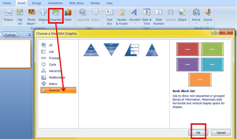
Locate the text box placeholders inside the pyramid and type in your data labels.
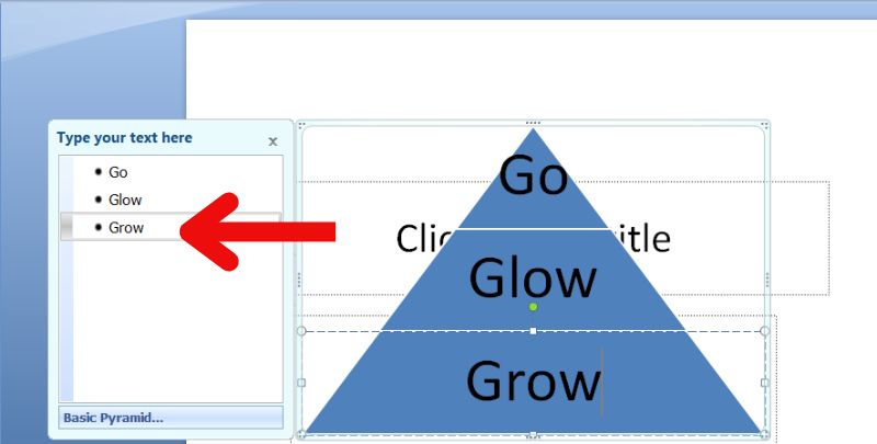
You can right-click on the pyramid and select Format Shape. This lets you change its look by altering colors, fonts, and borders. You can now save the PowerPoint.
Part 6. Make A Pyramid Chart in Word
The process begins by using Word's SmartArt features to form a foundation. Although Microsoft Word lacks an in-the-box option for pyramid charts, you can make one using its drawing and shapes or the pyramid. Afterward, text boxes are employed to designate each section of the pyramid. Here are the steps to make a pyramid chart in Word.
PROS
- Free and easily accessible.
- Shapes, colors, and styles of text to reach the intended visual effect.
CONS
- It may take more time than employing specialized chart creation software.
- There is no option to hover over elements to view specific data points, and the chart cannot be updated dynamically.
Open your Microsoft Word application and either start a new document or load one into which you wish to incorporate the pyramid chart.
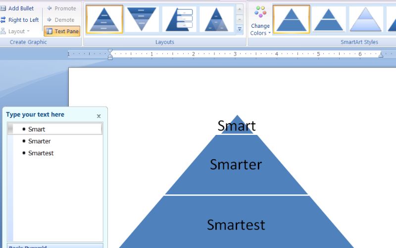
Select the Insert option from your toolbar's top, then SmartArt. Same to Microsoft PowerPoint, you may follow the remaining steps.
Part 7. FAQs on How to Create Pyramid Chart
What is a pyramid chart in Excel?
An Excel pyramid chart is a unique type of chart that looks like a triangle made of horizontal bars. It displays information in percentages that sum up to 100%. The size of each part shows the relative importance of the information it contains.
How do I make a graph in Word or Excel?
Type your information into the Excel cells. Select the cells that have your information. Head to the Insert section, pick your desired chart style (like Column or Line), and hit the Insert button. Utilize the Chart Tools (Design, Layout, Format tabs) to tweak your chart's components. Save the Excel file to keep your chart and data safe. In Excel, use Ctrl + C to copy your chart. Move to Word, select your desired location for the chart, and copy it (Ctrl + V). Click the chart in Word to update it from the linked Excel data. Save your Word file to ensure your chart and content are secure.
What does the pyramid mean in PowerPoint?
In PowerPoint, a pyramid is a chart showing hierarchy levels. It uses a shape to improve visuals and show organizational info.
Conclusion
These programs let you create a pyramid diagram. You can use them for many things, like studying data, making slides, working on group projects, or illustrating documents. Every app has unique functions. They handle different parts of showing and sending data. This lets users pick the best option for their needs and tastes.


