Double Bar Graph Tutorial: Example and Creation in 2 Methods
Being able to present data is essential for understanding complex details. The double bar graph is particularly effective among the various options available for analyzing data. This flexible chart allows you to compare two data sets, simplifying the process of identifying trends and patterns. Whether you're a student, a professional, or someone aiming to improve your understanding of data, this guide will provide the necessary skills to craft and interpret double-bar graphs confidently. We'll kick things off by explaining the concept of a double bar graph and offer examples from the real world to demonstrate its practicality. Following that, we'll look into different scenarios where double bar graphs are beneficial before moving on to the hands-on process of creating your double bar graphs with the help of MindOnMap and Excel tools. Let's get started!

- Part 1. What is a Double Bar Graph
- Part 2. A Common Example of a Double Bar Graph
- Part 3. What is It Used For
- Part 4. How to Make a Double Bar Graph
- Part 5. FAQs about Make Double Bar Graph
Part 1. What is a Double Bar Graph
You can define double bar graph as a graphical display of information that employs two sets of bars of different lengths to juxtapose two sets of data that are connected. Essentially, it's an enhanced version of a bar graph, enabling you to view two pieces of information next to each other.
The main elements of a double-bar graph
• Two Sets of Data: It shows two sets of bars for every category, enabling a straightforward comparison between two variables or groups.
• Categories: It shows every category or group under comparison on the x-axis (the horizontal line).
• Bar Pairs: Within each category, two bars are next to each other. Each bar symbolizes a different data set or variable.
• Y-Axis Representation: The y-axis (the vertical line) displays the data's count, quantity, or other numerical values.
• Color Coding: Usually, the bars are colored differently or have patterns to differentiate between the two sets of data.
• Legends: A legend is to clarify which data set each bar corresponds to.
Part 2. A Common Example of a Double Bar Graph
A typical double bar graph might compare the number of boys and girls engaged in various after-school activities at a school over a specific timeframe. Here are some examples of double bar graphs.
Categories and Axes
X-Axis (Horizontal): This shows the various after-school activities, such as sports, music, the arts, debate, and science clubs.
Y-Axis Representation: The y-axis (the vertical line) shows the data's count, quantity, or other values.
Bar Representation
Bar Pairs: For each activity on the x-axis, two bars are next to each other.
Male Participation Bar: One bar shows the number of boys involved in the activity.
Female Participation Bar: The other bar displays the number of girls involved in the same activity.
Color Coding and Legend
Color-Coded Bars: The bars representing male participation might be blue, and those for female participation might be pink or any other standout color.
Legend: A legend is to clarify the color coding, showing which color indicates male students and which indicates female students.
Interpreting the Graph
Comparison: The heights of the bars in each category indicate which activities attract more boys or girls.
Trend Analysis: The graph might highlight trends, such as more girls showing interest in arts and music and boys in sports.
Insights: This double bar graph assists the school's leadership identify areas where they might need to focus on encouraging participation from both genders.
Part 3. What is It Used For
A double bar graph serves multiple essential functions, mainly focused on comparing and examining data. Here are some primary applications:
• It allows a clear comparison of two data sets on multiple dimensions.
• Illustrating Differences: A double bar graph simplifies the visual recognition of differences and similarities between the datasets by aligning two bars next to each other for each dimension.
• Spotting Trends: It aids in detecting trends or patterns within the data.
• Emphasizing Variations Over Time: When the two bars represent data from different periods, it effectively highlights variations or changes in the data over time.
• Displaying Survey Findings: This technique showcases surveys' outcomes, particularly when various groups, such as gender, age, or income bracket, segment the responses.
• Educational Purposes: It can teach students to represent, compare, and interpret school data.
• Business and Market Insights: Companies use it to compare sales figures, market trends, or consumer preferences over different periods or locations.
• Resource Allocation and Planning: Organizations can use this to evaluate how resources, compare budgets and plan for future needs by examining different departments or projects.
Double bar graphs are useful tools in many fields. They support data-driven decisions and communication.
Part 4. How to Make a Double Bar Graph
Making a double bar graph is easy with different tools and applications. You can effectively present and analyze two data sets by following a few simple steps. In this part, we'll look into two common techniques: Using MindOnMap and Microsoft Excel. Let's start by learning the fundamental steps to create a double bar graph, regardless of your chosen tool.
Method 1. MindOnMap
MindOnMap, a double bar graph maker, mainly serves as a tool for creating mind maps to enable users to organize thoughts and ideas in a structured manner. It's not for displaying data, but its adaptability allows new ways to show information. Although it might not be the quickest option for generating intricate double-bar graphs, MindOnMap can act as a valuable initial step for generating ideas and visualizing data before moving the information to more specialized software for graphing.
Main Features
• The layered framework is effective for showcasing data types and their subdivisions.
• Utilizing various colors to distinguish between data groups is straightforward.
• Forms can serve as a means to depict data, although accuracy could be constrained.
• Integrating numerical figures as written content within sub-branches is possible.
• It facilitates real-time teamwork, which is advantageous for group assignments.
Secure Download
Secure Download
Go to the MindOnMap website, log in with your current account, or create a new one if you're a newcomer. Click the button to initiate a new project or mind map.
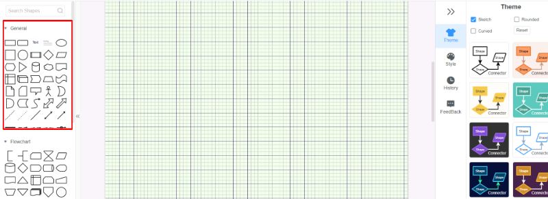
Search for chart or graph tool options within the MindOnMap interface. Choose the Flowchart icon.
You can make one by modifying a basic bar graph to include two sets of data bars. Utilize the tools for adjusting the graph's appearance. It could consist of changing the colors, adjusting the bar widths, labeling the axes, and adding a legend to differentiate between the two data sets.
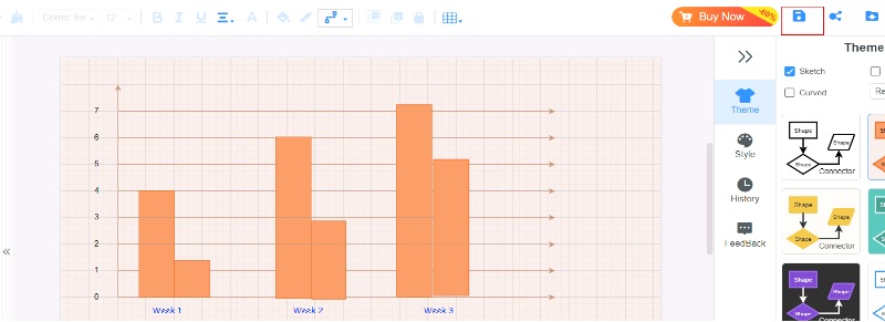
Once you're happy with the graph, save your project in MindOnMap. Additionally, you can save the graph as a picture or include it in different documents or presentations.
Method 2. Excel
Excel is a double bar graph generator for examining and presenting data, and making double-bar graphs is easy. Thanks to its wide customization features, you can craft polished charts that convey your information. Here is how to make a double bar graph in Excel.
While Excel is a strong tool for making double-bar graphs, it does have a few drawbacks:
• Although Excel allows for some personalization, it may not match the wide range of customization features of advanced data visualization tools.
• It doesn't automatically adjust to new data.
• Unlike certain data visualization tools, Excel graphs usually lack interactive features such as zooming, selecting subsets, or detailed exploration options.
Organize your information into columns or rows with clear names. Every column should represent a specific category or group of data, and every row should represent a particular piece of data within each category.
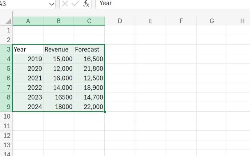
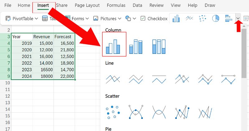
Use the click-and-drag feature to encompass your entire data range, including the labels. Navigate to the Insert tab located at the top of the Excel window. Within the Charts section, select the Column chart option. Then click the Clustered column chart.
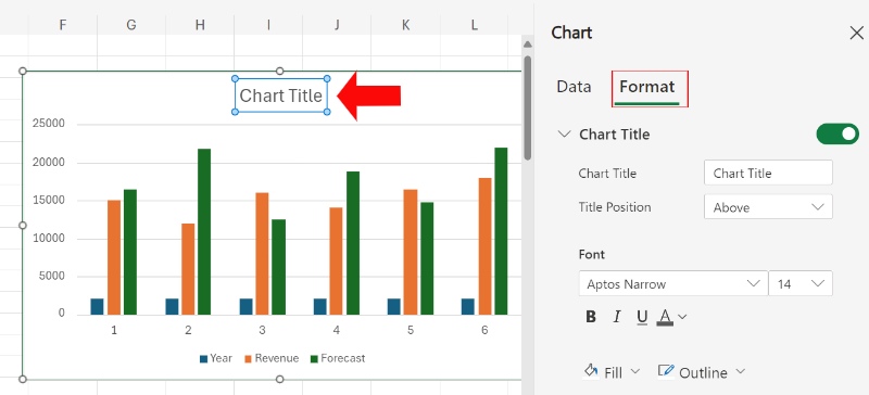
Locate the chart title spot and enter your preferred title. Select the axis you wish to label and type in the relevant information. Right-click a data series, choose Format Data Series, and adjust the look, color, and other features.
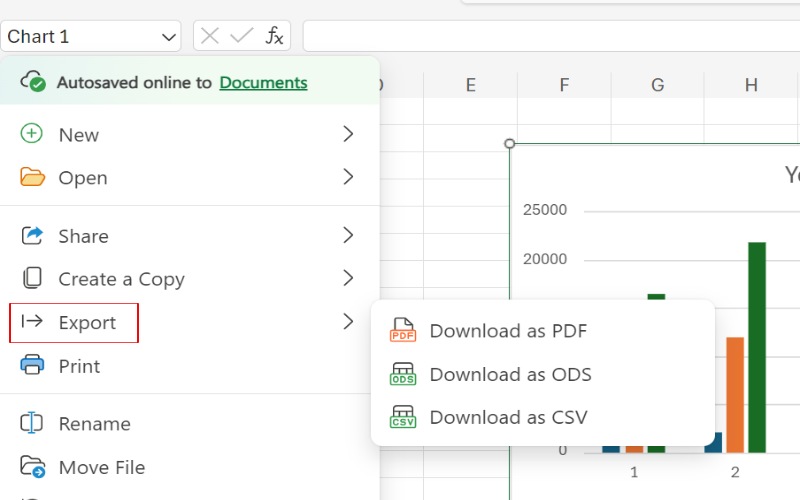
If you're satisfied with your data, save your double-bar graph by clicking File and Export.
Part 5. FAQs about Make Double Bar Graph
How do you make a double bar graph on Microsoft Word?
Regrettably, Microsoft Word is not for creating intricate graphs like double bar charts. Although it is feasible to add a simple chart, its ability to be customized and manage data is greatly restricted when contrasted with specialized software like Excel or specific graphing applications. If you still want to make a simple bar graph using Word, here are the basic steps: Insert a Chart. Navigate to the Insert tab. Select the Chart option. Select a chart type that looks like a double-bar graph. Type in your information for both groups. You can tweak the chart, like adding title labels and altering the colors.
How to make a double bar graph online?
Numerous digital resources are available that make it simple to generate double-bar graphs. Here is a selection of well-liked choices: MindOnMap and Google Sheets. Considering its functionality and simplicity, decide on the digital tool that fits your requirements. Fill in the tool's interface with your information. Tools typically provide options for manual data entry or spreadsheet import. Select colors, typefaces, titles, and additional visual components to improve the chart's look. Save the chart as a picture or embed it into a document or presentation.
How to create a bar graph?
Identify the groups you wish to examine. Acquire the related information for each group. Decide which data is on the horizontal (x-axis) and vertical (y-axis). By convention, groups are usually on the x-axis, and the values are on the y-axis. Utilize a ruler to sketch two perpendicular lines and meet at the point (0,0). Name the x-axis with the groups. Name the y-axis with numbers starting from zero. For every group, sketch a bar whose length matches its value on the y-axis. Make sure the bars have space. Title your bar chart with a concise and informative title.
Conclusion
A double bar graph is a graphical instrument designed to juxtapose two sets of data within different groups, aiding in the recognition of disparities and patterns efficiently. It is frequently employed in diverse areas such as education and commerce, making it suitable for showcasing connections and shifts over periods. Formulating a double bar graph is straightforward with double bar graph maker like MindOnMap or Excel, which offer user-friendly interfaces for entering data and modifying its appearance. In essence, double-bar graphs improve data conveyance and facilitate well-informed choices.