Step-by-Step Guide to Making a Segmented Bar Graph
A segmented bar graph is a chart that breaks data into smaller parts within each bar for comparing different groups or categories and their subcategories. Each part of the bar represents a category, showing its percentages. You can use it in many fields, like business and social sciences, to compare and understand data. For example, a company might use it to compare sales by product, region, or customer group. This article will show you how to make easy-to-read and eye-catching bar graphs divided into sections. You'll learn about organizing data, selecting the right visuals, and making the graphs easy to understand. By the end, you'll be able to represent your data and engage your audience accurately.

- Part 1. What is a Segmented Bar Graph
- Part 2. Make Segment Bar Graph with MindOnMap
- Part 3. How to Make A Segmented Bar Graph in Excel
- Part 4. How to Make a Segmented Bar Graph in Google Sheets
- Part 5. FAQs on How to Make Segmented Bar Graph
Part 1. What is a Segmented Bar Graph
A split bar graph, also called a stacked bar chart, makes data look nice and clear by breaking down different data types into smaller parts inside each bar. A bar graph divides into sections representing various subcategories.
How it works:
Each bar is designated to a specific category or group and divided into segments. Each segment is a subcategory of the bar's main category. The length of each segment is proportional to the percentage or proportion it represents of the total bar.
Key Characteristics:
• Effective for comparing multiple categories or groups.
• Demonstrates the composition of each group.
• Visualizes part-to-whole relationships.
• Utilizing different colors, patterns, or shades for each segment makes it easy to distinguish between the various subcategories and facilitate comparisons.
Part 2. Segmented Bar Graph Maker with MindOnMap
MindOnMap is a handy online tool for making mind maps and diagrams that's easy to use and lets you create different kinds of visual data displays. It offers a platform for brainstorming, organizing information, and creating visual aids. MindOnMap is mostly known for its ability to create mind maps. It also enables users to generate charts, including segmented bar graphs.
Best For
• Individuals and Small Teams: MindOnMap is ideal for solo or small groups looking for an easy-to-use platform for data visualization.
• Educational purposes: It's also great for academic settings, with a user-friendly design that helps make visual aids like graphs and charts for presentations or reports.
• Quick, simple visualizations: MindOnMap can quickly create basic graphs, like segmented bar graphs. It needs a little customization.
PROS
- Simple to get the hang of and pick up quickly, perfect for novices.
- You can use it online without installation, and it is accessible from any device with the internet.
- Supports multiple users working together on a diagram.
- Offers a range of chart types, including segmented bar graphs.
CONS
- Fewer customization options compared to specialized tools.
- Performance could be affected by large datasets.
- Free versions may have limitations on features or export options.
Steps in Making Segmented Bar Graphs in MindOnMap
Here is how to make a segmented bar graph: Open your preferred browser and search for MindOnMap in the search bar. Launch the link, click the New button, and choose the Flowchart feature.
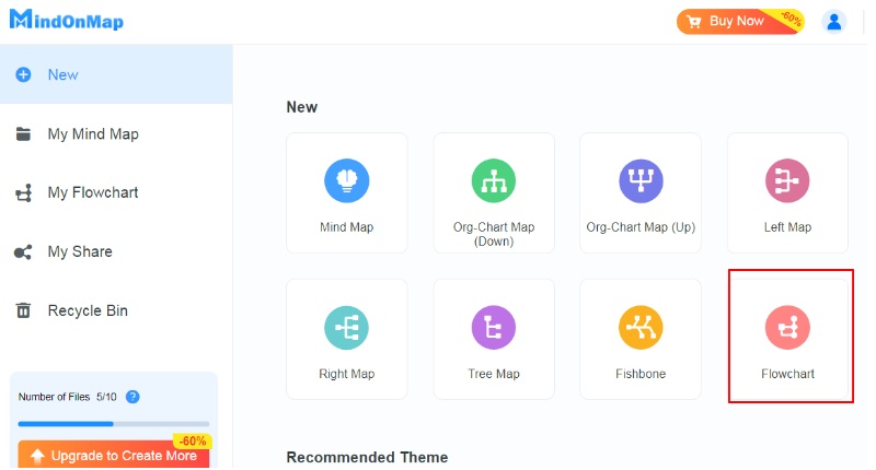
Select the Text button under the General panel on the left side of the screen. Manually input the text of your data.
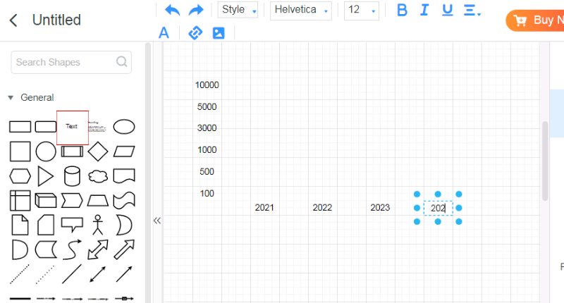
Next, establish the segmented bars using the shape under the General dropdown. Resize the Rectangle according to your data.
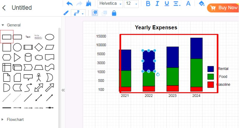
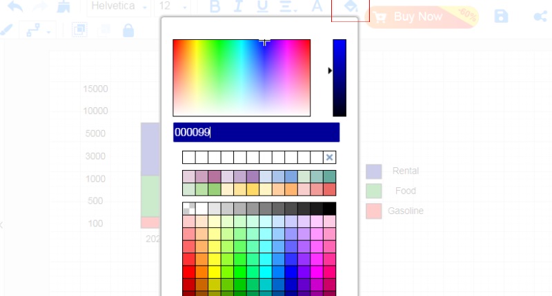
To change its color, just click the Paint Bucket to customize your bar colors. After that, you can save and share your work with your team.
Part 3. How to Make A Segmented Bar Graph in Excel
Microsoft Excel is a powerful spreadsheet tool. It can analyze, organize, and visualize data. It has a grid of rows and columns. It helps with input, calculations, and data manipulation. Excel's many functions, formulas, and charts make it a must-have tool. You can use it in businesses, individuals, and organizations in all industries.
Best For
• Excel is great at working with big data and doing complex math.
• It has strong features for cleaning, sorting, and changing data.
• You can personalize charts and tables a lot.
• It works well with other Microsoft Office apps like Word, PowerPoint, and Outlook.
PROS
- Advanced data analysis features.
- Flexibility in designing visualizations and reports.
- Popular among millions globally, known by many.
- Works well with other Microsoft Office tools.
CONS
- Advanced features demand time and effort.
- Need for a Microsoft Office license.
- Risk of mistakes from wrong formulas or data.
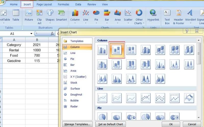
Organize your data into a table, with categories in one column and their values in the next, clearly labeling everything for better understanding. Choose the dataset you want to use in your graph, including category names and their values.
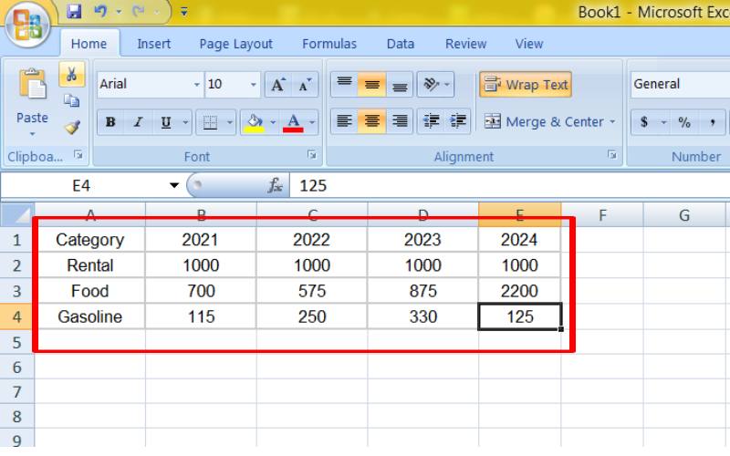
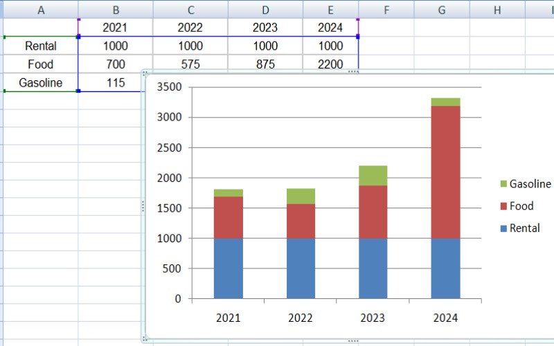
Go to the Insert tab in Excel, then click Charts in the ribbon. Select Column from the Charts dropdown menu and choose Stacked Column for a basic segmented bar graph.
Title your chart, add labels to the x-axis and y-axis for clarity, and include data labels to highlight specific values. Change the colors of the segments for better visual appeal and adjust the layout to make the chart easier to read.
Part 4. How to Make a Segmented Bar Graph in Google Sheets
Google Sheets is a cloud-based spreadsheet app. It lets users create, edit, and collaborate online. It is one of Google's productivity tools. It has a user-friendly interface and powerful data organization, analysis, and visualization features. Its real-time collaboration features, accessibility from any device with an internet connection, and integration with other Google services have made it a preferred choice for individuals, students, and businesses. While it resembles traditional spreadsheet software like Microsoft Excel, Google Sheets offers several unique benefits, including its free basic version and seamless integration with other Google Workspace tools.
Best For
• Google Sheets is great for collaboration in real-time, letting many people edit a spreadsheet simultaneously.
• You can access it from any device that's online.
• It's simple to share with others and give them access to different spreadsheet parts.
• There's also a free basic version that has the basic features needed.
PROS
- Can work together in real time.
- No software installation is needed; just access from any device.
- The basic version is free.
- Easy to connect with Google Drive apps.
CONS
- Needs internet for offline work.
- Fewer advanced functions than Excel, especially for specialized tasks.
- It might be slower with big data.
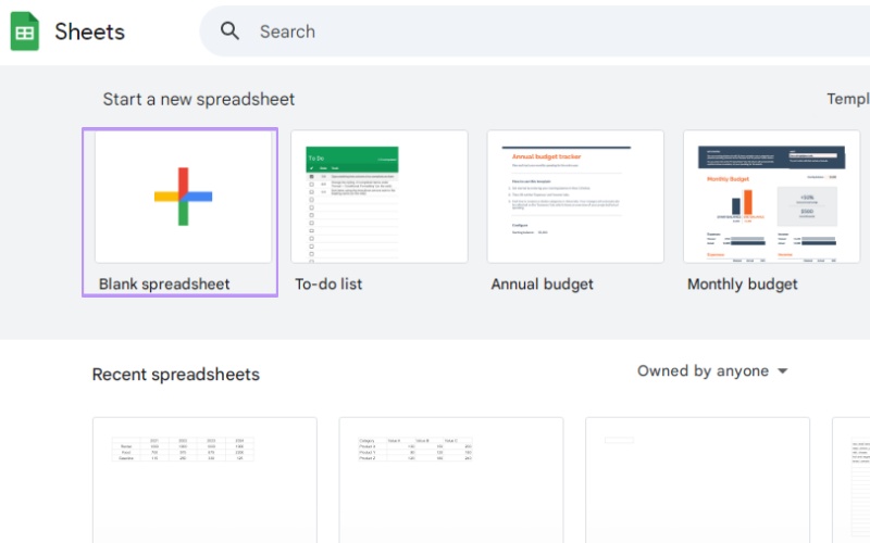
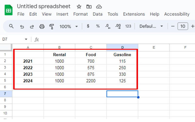
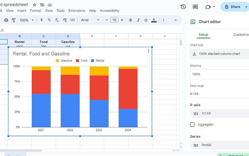
Create a new sheet to enter data. Make sure your data is sorted neatly in a table, with categories in one column and their information in the next, and clearly label each column.
Create a segmented bar graph by selecting everything you want in your graph, including the categories' names and data.
Find the Insert button in the Google Sheets toolbar, then click Chart from the dropdown. A chart that fits your data will appear. Choose a Column Chart and edit it by clicking the chart on the right for changes. You can edit it to a stacked bar graph.
Part 5. FAQs on How to Make Segmented Bar Graph
How to make a segmented bar graph in Google Docs?
Unfortunately, you cannot directly create a segmented bar graph within Google Docs. Google Docs is primarily a word processor and doesn't have built-in chart-creation capabilities. However, you can create a segmented bar graph using Google Sheets and embed the resulting chart into your Google Doc. Create a new Google Sheet. Input your data in a clear format. Insert a chart, choosing the segmented bar graph type. Customize the chart as needed. Copy and paste the chart as a picture into your Google Doc.
How do you customize a graph on Google Docs?
While Google Docs doesn't have extensive graph customization options, you can apply basic formatting changes to a chart embedded from Google Sheets: Resize: Adjust the chart's size to fit your document. Add a title: Provide a clear and descriptive title to the chart. Change font: Modify the chart elements' font style, size, and color. Add labels: Include axis labels and data labels for clarity. Adjust colors: Change the chart's color scheme to match your document's theme. Note that for more advanced customization, you must make changes directly in Google Sheets before embedding the chart.
How to make a simple bar graph?
Using excellent bar graph makers like Google Docs, creating a simple bar graph is straightforward. Follow these steps: Insert a chart into your document. Choose the bar chart type from the available options. Input your data into the chart editor. Customize the chart with titles, labels, and colors as needed. Keep in mind that a basic bar graph shows data with bars, and the size of each bar shows how much something in a certain category is worth. It's useful for comparing values across different categories.
Conclusion
Segmented bar graphs are great for showing complex data. They split data into parts within each bar to compare, show, and spot trends. This guide covers everything about them, like what they are, how to use them, and how to make them with different tools. You can use MindOnMap for easy use, Excel for its advanced tools, or Google Sheets for working with others. Now, you know how to make clear and attractive segmented bar graphs. Make sure your data is ready, pick the right categories and parts, and tweak your graph to share your findings well. Learning this skill can improve how you tell stories with data and make decisions.


