A Detailed Steps to Create Powerful Funnel Chart Excel
At the heart of a successful business is its sales pipeline. Yet, dealing with complex data can be challenging, hindering your capacity to examine your sales process and identify improvement areas. Funnel chart Excel is a visually engaging instrument that illuminates your sales journey. This guide will provide you with the know-how to construct effective funnel charts in Excel, guiding you through a series of steps from organizing data to personalizing your chart. Let's also recognize the best alternative, MindOnMap. We'll cover both techniques, enabling you to select the best method that matches your abilities and requirements. Let's turn your sales pipeline data into a valuable and enlightening visual story.

- Part 1. Create a Funnel Chart in Excel
- Part 2. Advantages and Disadvantages of Using Excel to Make Funnel Chart
- Part 3. Best Alternative to MindOnMap
- Part 4. FAQs on How to Create a Funnel Chart in Excel
Part 1. Create a Funnel Chart in Excel
This manual provides you funnel diagram Excel with the necessary skills to craft powerful funnel charts in Excel, no matter where you are in your journey. We'll take you through every part of the process, from preparing your data to making your chart what you need, with easy-to-follow instructions to transform your sales information into a clear and significant representation. Let's begin by learning how to generate a funnel chart in Excel.
Ensure it includes every part of your sales process, like the right measurements for each step. Organize your info in a simple table inside your Excel sheet. Each row should be all about a particular step, and each column should represent a different stage.
Click the Insert button from the Excel ribbon. Then, go to the Charts area on the right side of the ribbon. Using the menu options, choose a chart style. Choose Funnel. This will add a basic sales funnel to your document.
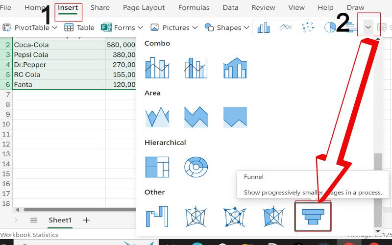
An Excel Data Source Selection window will pop up. Ensure the right data range, including stage names and their metrics, is highlighted in your table, then click ok if the inputs are correct. Select the Insert button from the Excel toolbar. Click on the Charts button at the right end of the toolbar.
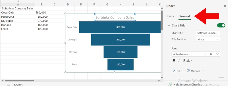
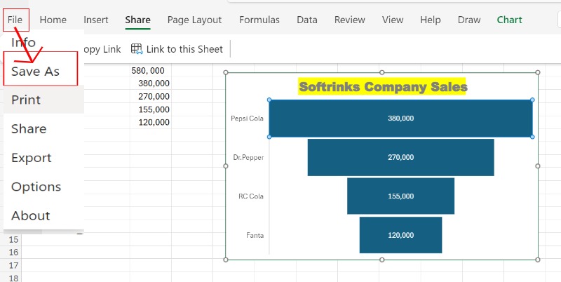
To improve understanding, consider adding a chart title and axis labels. Type your chart's title in the chart title area, right-click on the axes to edit labels and gridlines, and then save your funnel chart by clicking the File menu and saving.
Part 2. Advantages and Disadvantages of Using Excel to Make Funnel Chart
Once you get the hang of making a funnel chart in Excel, choosing Excel as your go-to tool for funnel charts is a simple and user-friendly way to do it. But it's essential to consider the good and bad points before choosing. Here is based on my own experience.
PROS
- Excel is a popular program available on nearly all computers, meaning you won't need to spend extra money on software.
- As your sales data often comes in spreadsheet format, Excel integrates this data into your funnel chart straightforwardly, instantly reflecting updates.
- The Excel funnel chart template allows adjustments to colors, data labels, and layout for better visibility.
CONS
- The charting capabilities of Excel fall short compared to specialized data visualization programs.
- Excel is adequate for basic funnel charts. Yet, creating them can be time-consuming, particularly for complex charts with extensive data or intricate formatting.
My Personal Experience
At first, Excel was a good enough option for creating funnel charts to track my sales progress. However, as my needs got more complex, I realized they had limits, which made me search for other more appealing and user-friendly options. In short, Excel is a great tool for basic funnel charts if you're okay with it and need something free. But if you want more detailed visuals and a nicer interface, getting a special tool for data visualization might be worth it.
Part 3. Best Alternative to MindOnMap
Although Excel is a popular choice for making funnel charts, an unforeseen competitor emerges: MindOnMap. MindOnMap provides more than just mind maps! It's a versatile tool that allows you to produce various visual displays, including funnel charts. It has an easy interface and drag-and-drop feature, which makes it great for newcomers. However, its powerful capabilities are for skilled users.
Main features
• It lets you drag and drop elements easily to create your funnel chart.
• Spark your creativity with ready-made funnel chart templates.
• It provides a wide selection of customization features for colors, shapes, fonts, and images to make your funnel chart unique.
• Collaborate with your team on your funnel chart in real-time (with paid plans), ensuring smooth collaboration and feedback sharing.
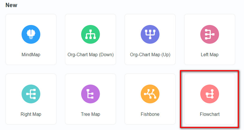
Go to our website to create a free account. Explore the available chart templates and choose the Flowchart.
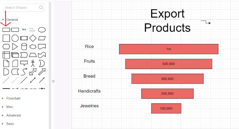
You can put shapes together to create a funnel chart. Pick a rectangular shape and move it around to look like a funnel. Click on each shape to tweak its text and info. Use the formatting choices to change the colors and fonts and add icons to make it more eye-catching.
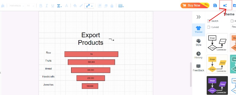
When you're satisfied with your funnel chart, it's time to finalize it and share or save it in various formats like JPG, PNG, PDF, or directly with colleagues for presentations.
Part 4. FAQs on How to Create a Funnel Chart in Excel
How to insert a funnel chart in Excel?
Here are the detailed steps for creating a funnel chart in Excel. Funnel charts help show how data moves through different steps or phases, like sales pipelines or stages of a process. Organize your info into a table, sorting it by steps and their values. Make the data spread out more, including the title. Go to the Insert tab. Hit the Insert button, then pick Funnel. Change the chart by adding labels to the data, changing the colors, and tweaking other parts with the right-click menu.
How do I add data labels to a funnel chart in Excel?
Locate your funnel chart and select it to incorporate data labels onto a funnel chart in Excel. Locate the plus sign at the top-right corner of the chart, ensuring the Data Labels option is selected. Go to the Chart Tools spot, click the Design tab, and choose the Add Chart Element button. After that, hover your mouse over the Data Labels area to determine where you want them to go. Click on the data labels, pick the Format Data Labels option, and tweak them as you like.
What is the difference between a bar chart and a funnel chart?
A bar graph is great for showing how different groups compare because it's easy to read and used a lot. On the other hand, a funnel graph is perfect for showing steps in a process. It makes the data easier to understand at each step, pointing out when it gets smaller or changes.
Conclusion
Funnel diagram Excel is known for its skill in handling data and offering a wide range of options, yet it demands a thorough and intricate procedure. MindOnMap provides a great option due to its straightforward interface and basic features, simplifying the task for users seeking a more streamlined and intuitive approach. The decision between Excel and MindOnMap hinges on the individual's requirements, their expertise with the software, and the degree of complexity required for the funnel chart.


